Other Interesting Pages

Tuesday, August 31, 2010

Schakolad Pier


Today, an architectural confection for you! Chelsey Cash of Schakolad has created a chocolate replica of the St. Petersburg Pier. This is actually a tribute to the 36-year-old landmark, which is soon to be replaced by a newer pier. Chelsey's masterpiece will be on view at Schakolad through September, after which I'll be volunteering at my favorite chocolate company (to help dispose of the pier).

Chelsey's effort merits the 5-Cocoa Bean Award.


Sunday, August 29, 2010

Architectural Influences

I mentioned in my last post that my grandfather was an influence in my love of things classical. I would be remiss if I didn't also mention the influence of my father, who was an architect by training, though not by profession.


One of my father's professors required students to turn in weekly index cards of different architectural styles. The top image is a 5" x 3.5" rendering of the Louvre. The bottom image is a detail of the center of the sketch, and measures approximately .75". This is the only such card of his that I have – I would dearly love to have seen the whole set!

Friday, August 27, 2010

Finials and Urns


I have a thing for finials and urns, and sometimes I hit the jackpot and find both in the same object. I found this wooden finial recently at a St. Petersburg antique shop. The carved flame and wreath base made it a must-have. Incidentally, the correct description of the grooves, as they would apply to columns, is "serpentine fluting."


The base has one corner that needs to be repaired. It looks as though there might have been a struggle to pry it from its last home, but how fortunate that there was no further damage.


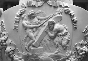
How is it that some of us are so drawn to certain iconic shapes and objects? Is it due to genes, past lives at Versailles, teachers, our environment? I have no doubt that part of my attraction for things classical is because – when I was just out of toddlerhood – I spent many hours following my grandfather as he methodically documented Washington, D. C.'s National Gallery. He used a Zeiss Ikon, always shot in black and white, and always printed on a heavy matte paper. Like the one above, his images were rich in contrast and all these years later, still wonderful to study. This is a detail of an ornamental urn by the French sculptor Claude Michel, known as Clodion. It was carved in 1785.

Tuesday, August 24, 2010

A Classy Merger

David Airey has an inspiring and beautiful blog named Logo Design Love. On August 13, he featured the witty design work of Johnson Banks under the title, "What do you get when you cross ..." Banks imagines the merger of corporations and then combines their logos to make interesting and amusing typographic statements. 


Banks' work inspired me to design a logo for a new mega company of great style, the merger of Polo and Izod! Found only in the very best stores.

Sunday, August 22, 2010

Thomas Jefferson and Paint


As you can see, I am a great fan and student of Thomas Jefferson's Monticello. So it was with great interest that I read the July/August edition of Elle Decor. It features the makeover of Jefferson's dining room, which has been bathed in a subdued Wedgewood blue for more than 70 years. New research indicates that around 1815 the dining room was painted, at great expense, a chrome yellow. The yellow that Jefferson used was 33 times the cost of white paint (Imagine what Jefferson would have done with a credit card!).


Jefferson and Monticello, the Biography of a Builder, by Jack McLaughlin, is a particularly interesting book. It talks in part about the problems of painting at Monticello. Of course Jefferson didn’t have the luxury of running to Lowe’s or Home Depot. Instead, he hired a master painter by the name of Richard Barry to come and paint for two full years. From Jefferson and Monticello comes this account:

“House painting during the late eighteenth and early nineteenth centuries took much more skill than is required in our age of manufactured paints and high-speed application techniques. Paints and varnishes were mixed by hand, and colors were created by eye. The only method of application was by brush or spatula. Like most of the building trades, painting technology had changed little in hundreds of years. Paint was made possible by the properties of certain vegetable oils, particularly linseed oil, which is derived from pressed flax seed. When most other oils are spread thin and allowed to dry, they form a sticky, gummy residue, but linseed oil will spread into a hard, tough film. If resins are added, it becomes a varnish; the addition of white lead and pigment produces paint. Master painters such as Barry were expert at mixing linseed oil, white lead, color pigment, and turpentine into a high-quality paint. They were also skilled in applying paint, not only in single colors, but in an imitation of grained wood, marble or stone. Barry painted imitation wood grain and stone at Monticello, and quite possibly artificial marble for the fireplace fascias, which were later replaced by the real thing ...”

Mr. McLaughlin also mentions that Jefferson painted some of his floors, including the entrance hallway, a grass green. It was a stylish floor treatment at the time, and a great advocate was Gilbert Stuart. He supplied Jefferson with a hand-painted “chip,” which Jefferson passed on to the house painter.

Friday, August 20, 2010

Greek Keys


If you're like I am, you love Greek keys so much that you keep a file on them. Mine is labeled "Greek Keys and Seals." The graceful key above appeared in a 1926 Westvaco Inspirations for Printers (I'm a little behind in my reading.). I'm sure it predates that time because the little fence-like decoration on top is typical of many 19th century typographic borders.


This beauty is a Pompeian tile design. It's from the 1856 The Grammar of Ornament, by Owen Jones. The Grammar of Ornament was a major reference for graphic designers and lithographers of the 19th century. Jones was an architect, designer and teacher, and was appointed Superintendent of Works for the Great Exhibition of 1851 (the first world's fair). One person who immersed himself in The Grammar of Ornament was none other than Frank Lloyd Wright.


For my own house, I copied a Greek key from an Irish castle. The key measures 4" deep, is entirely hand-painted, and extends around the living room, dining room and a hallway.


When newcomers to the house realize that the Greek key isn't stenciled, they always say, "That's insane!" (Actually they say, "You're insane!") But the truth of the matter is that I divided the project into two-hour segments per evening, and it was very easy and meditative. I skipped watching TV, relaxed on the floor and solved all the world's problems.

A Dedication


About a year ago, Susan Halttunen, a good friend and a fine designer, made me aware of Nick Olsen, who is a rising star in the New York design world. When I Googled Nick, I discovered that he had a blog, and so was introduced to the world of blogging. I quickly discovered so many interesting and beautifully designed sites from all over, and I realized that I also had things to share with the blogging community. This then  inaugurates All Things Ruffnerian, a Design Blog and More — all those passions I'd love to share with you! So a special thanks to Susan for the inspiration, and I hope you enjoys my posts!