Other Interesting Pages

Friday, July 29, 2011

Enjoy the Weekend

Mark D. Ruffner, 2011
It's been a busy, hot week, and if you're like I am, you're probably ready for a relaxing weekend. So no art, antiques or history today, just this serene view from my dining room window. Have an enjoyable, peaceful weekend, blogging friends, and I'll have a new posting on Monday.
.

Sunday, July 24, 2011

Greg Jones: Carver of Birds

In my last posting, I showcased the bird paintings of my friend, Greg Jones. When I first met Greg, he was experimenting carving slate, which is a rather unforgiving medium.

Blue Heron

Greg preferred carving wood, and exhibited his wood carvings in shows and galleries around the country. I'm so glad he documented these pieces, so that I can share them with you.

Future Flights of the Phoenix

Soaring
These two pieces, Future Flights of the Phoenix and Soaring, as well as Eagle, below, were carved in mahogany. Greg's signature style has been to carve motion, as well as the bird.

Eagle


Unison Call
In this piece, Greg depicted two cranes going through a ritual of unison calling. One rises to call as the other lowers, and then they repeat the call in reverse. This is what mahogany looks like when it's bleached.

Spring
Spring, a carving of two egrets, was one of Greg's most popular carvings, and he produced a number of variations.

Mark D. Ruffner  |  St. Petersburg Times  |  2001
Ten years ago, I was asked to design a cover for a Times Christmas gift guide. The newspaper wanted the design to suggest a "Florida holiday," so my solution was to use red and green in this manner, putting the warm colors in the foreground and cool, Florida colors in the background. The focal point is Greg's egrets, a quintessential Florida view, and the one element that really makes this piece pop.

Today, Greg Jones has retired from wood carving, but he continues to paint.

Every artist benefits from a trusted friend who will give honest and insightful critiques, and over the years, I've been lucky to have Greg as that voice for me.
 .

Wednesday, July 20, 2011

Greg Jones: Painter of Birds


Occasionally I mention my dear friends Sandy and Greg in this space. Sandy was a coworker of mine, and her husband, Greg Jones, is a fine artist. Greg retired from a very successful advertising career in New York to paint and carve in sunny Florida. In this posting, I'm going to feature his bird paintings, images I've grown to love through years of visiting, and many delightful dinners.

Click to enlarge

This painting, Toucan and Papayas, is one of my favorites. It's so evocative of things tropical and exotic, and I like the atmospheric quality it has. When I paint, I tend to bring everything into sharp focus and I want to give everything a sharp edge. Greg, however, paints images as our eye actually sees them. Look at the leaves in this painting and you'll see the brushwork of someone who has spent a lot of time observing nature.

Blue Jay 1

The blue jay reappears throughout Greg Jones' paintings. The feisty bird is a member of the crow family and is common in Florida. Greg has shared an interesting fact with me about the blue jay, which is that it actually isn't blue! The blue jay has gray feathers that refract light so that they appear blue.

Blue Jay 2
This painting of a blue jay captures the bird's attitude so well, we really could call it a portrait. A whole class in composition could be taught around this painting — look at the interaction and balance of the pot's ellipses, how the watering can spout is mirrored by the leaf next to it, how the bird is framed in a darker negative space, how the most intense color of the furthermost pot approximates the complimentary color of the bird and points to it — and I could go on. A great painting of rhythm and balance!

Mourning Dove
The high-contrast background of this painting is atypical of Greg's paintings, but it really highlights the soft green leaves that were the inspiration for the work.

Spectacle Owls (Panama)
Click on this painting to enlarge it and appreciate the detail. It's another painting of great atmosphere, and always gets the most comments from visitors to Sandy and Greg's.

But I've only shown you one side of Greg Jones' work! In my next posting, we'll look at Greg's bird carvings.
.

Saturday, July 16, 2011

Keeping a Log


When I was in my early twenties, I fell in love with a beautifully bound, gilt-edged book. I had to have it, to keep a journal! Then a funny thing happened; I was intimidated by the beauty of the book and worried that my journaling might seem trite with time, and essentially ruin the book. And while I wouldn't entertain such thoughts today, I never did use that book.


That notwithstanding, I've always had an urge to keep track of time, and so began 32 years ago to keep a daily log. Long before personal computers, it started out hand-typed and richly illustrated. As you can imagine, that was cumbersome and too time-consuming, and only lasted several months.


The log-keeping of the next 20 years was on sheets of legal paper. Entries were short, detailing in abbreviated form, events of the day, places of the day, meetings, projects and phone numbers. That's all. No bits of conversation, no emoting or introspection, just a synopsis of each day. It would take about five minutes out of every evening and was easy.


Eventually, about twelve years ago, my logging became computerized, and as you can see from this screen-save of the past month, each day is a maximum of only about seven lines. At the end of the year, I make a hard copy of the log and add a title page.


The benefits of keeping a daily log are many. It's a good idea in any event to review one's day, and to contemplate how you've lived it. A daily log is also a tremendous reference book for remembering names, reconstructing events (when talking to customer service, for example), and checking against (telephone) billing or credit card debits. I regularly consult my logs when filling out forms that require job histories, and I use my log as a reference at tax time. Interestingly, friends have consulted me when they needed to remember their own information for form-filling. Beyond that, logs can be a sort of scrapbook, and occasionally I'm simply curious to know what I was doing a year ago.


I like to use an appointment book, one which allows me to see the whole month at a glance. I keep them all, especially since they sometimes hold information the daily logs do not.


Of course I have some sketchbooks, and I update other books as well. Above, in respective order, is a dream log that resides bedside, a book of family history to which I add yearly chapters, a book of home renovation, a book of collected quotations, a little black book of holiday lists, and a small book of designs. As a lover of paper, I haven't yet succumbed to the lure of the iPad, though I certainly wouldn't discount that possibility for future logging.

How about you? Blogging aside, do you journal or keep logs in this Information Age?
.

Tuesday, July 12, 2011

Designer Clarence P. Hornung

Cabarga  |  Logo, Font & Lettering Bible

Clarence P. Hornung (1899-1998) was a most prolific designer. He began his career in the 1920s, working for the American Type Founders Company and designing decorative typefaces like the Tory initial below.


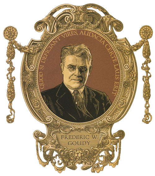
An early Hornung illustration of the great American type designer Frederic W. Goudy is in the same meticulous, masterful style.


Cabarga  |  Logo, Font & Lettering Bible


A nice touch in this 1926 illustration is the lettering of the inscription, which incorporates one of Goudy's own typefaces. Hornung and Goudy were friends, and this illustration is a beautiful tribute from one type designer to another.


Hornung also designed over 400 logos, many for major U.S. companies. The logos above are for the Encyclopedia Britannica, the American Type Founders Company, and Farrar & Rinehart Publishing. Hornung even designed a very early logo for General Motors.

from gaspumpheaven.com

Perhaps Hornung's most recognizable logo is the one he designed for Richfield Motor Oil, circa 1940.


During World War II, Clarence P. Hornung contributed to the war effort by creating many designs with patriotic themes, like this 1942 calendar. In fact, he would later edit The American Eagle in Art and Design.

from oldprintshop.com
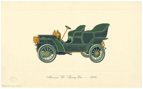
In 1965 Hornung released a boxed set of dozens of lithographs of historic American automobiles. He began his auto illustrations in 1949, after he learned that there was no pictorial history of American cars. Hornung was nicknamed "The Audubon of the Automobile," and his lithographs are still very collectible.

eBay
Clarence P. Hornung wrote and edited dozens of books on design, and many of those books are still in print from Dover Books. Aficionados of American antiques and folk art will recognize Hornung's definitive 2-volume Treasury of American Design.

If that weren't enough, Hornung created industrial designs and packaging, and even patented a camera.

Leslie Cabarga, a good friend of Hornung and author of the excellent book, Logo, Font & Lettering Bible, writes some personal stories about Hornung, and relates how he died at a very late age with many design projects still in the works.

On April 28, 2012, Hornung's great-granddaughter left a comment (see below)
to let me know that Clarence P. Hornung died at the age of 99, in 1998.
.

Friday, July 8, 2011

Greek Keys No. 4


I had to laugh at myself when I saw this Greek key on the floor of the Tampa International Airport. I kept wanting to find a repeating pattern, but there is none! It's completely irregular.


I was in New York City and saw this place setting at the Jonathan Adler store, on Madison Avenue.


As a graphic designer, I'm attracted to the key of this Tory Burch storefront, which is simply his initial repeated. It's a design solution reminiscent of the great English designer, David Hicks.


Photo by Van Chaplin  |  Southern Living
The border design of the linens used by designer Randy Powers is the same concept of repeating "T"s.


Here I've recreated tile work I noticed at the entrance to a store in Sarasota, Florida. It could easily be from Pompeii.


And this is a detail of a Pompeian fresco.
.

Tuesday, July 5, 2011

Il Papiro


Recently, my friend Yvonne gave me this charming pen holder from Il Papiro. It was a delightful reminder of a trip to Florence I took several years ago with my friend Sandy. I have a great love for beautiful paper, and I knew even before our departure that buying good marbled paper would be high on my list of Florentine experiences, right up there with visiting the Uffizi.


My favorite marbled paper is this feathery pattern, probably because it always brings to mind the end papers of finely bound books. I bought sheets of this as possible back-matting. Il Papiro sells other patterns, too, like the one below, which truly looks like marble.


We befriended Ricardo, the charming manager of the Il Papiro stores in Florence, who gave us a demonstration of this age-old art.


My focus was on paper, but Il Papiro has many stationery items, including beautifully bound notebooks. I couldn't resist getting several sheets of this quintessential Florentine paper, which I've somehow come to associate with Christmastime.


I enjoyed Il Papiro so much that I came to regret that I had not gotten a photograph of the storefront. I guess I voiced that regret several times because a year later my brother visited Florence, and upon his return, painted this lovely view of the store's entrance for me. What a thoughtful gift!


 Firenze   |   Venezia   |   Roma   |   Siena   |   New York   |   Palm Beach

.

Friday, July 1, 2011

Tony Meeuwissen, Magical Illustrator


Tony Meeuwissen (b. 1938) is one of England's foremost illustrators. Though he received no formal art training, he served a five-year apprenticeship at an art studio, then worked as an art director for several London advertising agencies. In 1968, Meeuwissen began working as a freelance illustrator. His commissions have included work from the Sunday Times, Penguin Books and record companies.


Meeuwissen's distinctive designs are always an elegant balance of fine composition and the highest degree of painting craftsmanship. His work is also imbued with much humor and charm.


Perhaps you've seen designs by Tony Meeuwissen on packaging for Crabtree & Evelyn, and Winsor & Newton. He also designed his own book, Remarkable Animals, 1000 Amazing Amalgamations.


Meeuwissen has received the Francobollo d'Oro for the best world stamp design. Here are several of his designs (but I don't know if one of these won the award!).


I was first introduced to Tony Meeuwissen when I was gifted with his deck of cards (and accompanying book from Running Press Book Publishers), entitled The Key to the Kingdom. The deck is the premier example of transformation cards, more about which can be learned here. I'm going to include eight of my favorites — the first card is the reverse design for all the others.


Tony Meeuwissen has received numerous honors, including being the only illustrator to win the Gold D&AD (Design and Development) award, which he won twice. His work has also been purchased by the Victoria and Albert Museum. Now 73 years old, Tony Meeuwissen continues to illustrate.
.