Other Interesting Pages

Friday, January 23, 2015

Pompeii No.42: A Return for Marcus Aurelius


My original idea for filling this wall was to create a trompe l'oeil arrangement that resembled a wall of the London residence of Sir John Soane.

musicartlondon.wordpress.com
Not only was Soane England's premier Neoclassical architect, but he appears to have been the first person to collect architectural salvage on a large scale. Later in life, he trained young architects from his house, and his collection became an important source of learning for them. Sir John Soane had a very modern design sense, and I'm a huge fan of his work. You can read more about him in the homage I posted here.

At some point, though, I realized that to continue my masonry lines and to also paint architectural remnants would be much too busy, and that I would be better off to pick one great sculpture and give it preeminence.

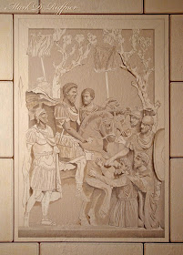
I settled on this huge sculpture of barbarians kneeling before Emperor Marcus Aurelius, who is about to pardon them. The sculpture, which is nearly life-sized, is incorporated into the main staircase of the Palazzo del Conservatori, one of the Capitoline Museums. It's interesting that the emperor's gesture mirrors the statue of him that is in front of the same museum, below.


Looking at the composition, I was bothered by one head that seemed slightly out of scale, and which, in my opinion, detracted from the head of the emperor's immediate companion, Tiberius Claudius Pompeianus. And so I took the liberty of removing it — adiós!

I begin by outlining the figures. All the straight lines are still in pencil because I'll go back and define them with a straightedge.
click to enlarge
Next I work in the middle of the image because I want to be satisfied with all the faces early in the process. I'm using Sherwin Williams paints the same way I'd use artists' acrylics, developing depth through washes of increasingly darker tones. I generally paint a range of middle tones, then paint darker tones, then paint highlights. Most of the real work is done in the middle tones.

click to enlarge
Here's the final image, what I call the Marcus Aurelius Plaque. You might recall that there is a roundel portrait of the emperor on the other side of the kitchen door, so I now also have a Marcus Aurelius Wall.

Looking towards the living room — I painted the plaque to match the coloration of the transom sculptures.

Here's a view looking back towards the kitchen.

In the next posting, I'll address something that's been bothering me for months, and I know it will improve the whole room. I hope you'll join me then!

.

Sunday, January 11, 2015

Pompeii No.41: The Kitchen Masonry

Here's the kitchen masonry painted, and now the Pompeii Room is starting to look finished on all three sides (four, if you count the transom). As you can see, the mural turns a corner into the living room, to meet a bookcase.

Because the masonry is rather stylized, I've kept the pediment equally simple, but I haven't decided whether it should be more ornate. On one hand, more detail might be fun, and on the other hand, no amount of detail will make the pediment truly trompe l'oeil because the 3-dimensional door frame is always seen at close range. What do you think — more detail, or leave as is?


Here's the kitchen surround, looking into the living room. As you can see, the kitchen masonry dovetails into the transom, which in turn meets the masonry of the opposite wall.

I've left room for a plaque to go in this space, and it might just be my favorite detail yet. Can you guess what will go here? All will be revealed in the next posting, and I hope you'll join me then!
.

Friday, January 2, 2015

Pompeii No.40: The Kitchen Door Frame

In my posting No. 39, I revealed the corner of my dining room dedicated to Marcus Aurelius, below:

click to enlarge

Now it's time to move to the the yellow wall and tackle the kitchen door and the area that surrounds it, as seen in the diagram above and the image below:

Oh, oh, the color photo didn't turn out too well, so we'll make it a duotone and pretend it's an old archival image. The door frame was put up before I had any thought of a mural, so it's not Pompeian in style. I'd describe it as Elizabethan.

The door frame was designed around two angelic furniture details that were a Christmas gift many years ago from my sister-in-law, Alice. The rest of the door frame was built to my design by a very talented artist, Jerry Jones. When I designed the door, I was actually thinking of that great English treasure, Knole House, below.

knoleconservationteam.wordpress.com

Because the door frame was moved to my house from my previous address, it was not exactly flush to the wall. So the first order of business was to fill in a slight gap with a mixture of caulk, spackle — and on some rounded edges — papier maché.

I've painted the door frame to look like stone, and the rest of the wall will match the other masonry in the room.

Here's the finished kitchen door and the base coat for the wall, with masonry lines penciled in.

If you look closely, you can see that I've penciled a pediment over the door frame. I hope the result will give it a slightly more Neoclassic feel.

And I hope you join me for the next posting,
when I paint the blocks, and mortar them into place!
.