 |
| Photo by Fritz Von der Schulenburg | Neoclassicism in the North | Groth | Rizzoli, 1990 |
This is
not wallpaper. Far from it. You're looking at the 1823 bedroom of King Carl XIV Johan of Sweden. The room was meant to resemble a battlefield tent, and it was the popular bedroom fashion for the crowned heads of the Napoleonic era. A prime example is Empress Josephine's bedroom at Malmaison, below.
 |
| The French Empire Style | Alvar Gonzalez-Palacios | Hamlyn, 1970 |
For those unable to buy tons of satin and velvet, there was always wallpaper — and very regal wallpaper, too.
 |
| L'Art de Vivre | The Vendome Press, 1989 |
 |
| Architectural Digest, October, 1995 |
 |
| L'Art de Vivre | The Vendome Press, 1989 |
The three previous images are the designs of Xavier Mader, who worked in France for the Dufour company, from 1808 to 1823. These wallpapers are an interesting social statement; while the nobility lost political relevance in France, and as the middle class grew, the preferred aesthetics remained that of the nobility.
 |
| L'Art de Vivre | The Vendome Press, 1989 |
This anonymous, delicate French wallpaper design includes the framed prints below the fabric and the surface behind them — wallpaper of fabric upon fabric.
 |
| Photo, Robert Lautman | Greek Revival America | Kennedy | Stewart Tabori & Chang, 1989 |
The Neoclassic fashion of curtained wallpaper extended to the United States. This is the dining room of the Campbell-Whittlesey House, in Rochester, New York. It dates to 1836.
 |
| Photo by Mick Hales | In the Neoclassic Style | Fleischmann | Thames and Hudson, 1988 |
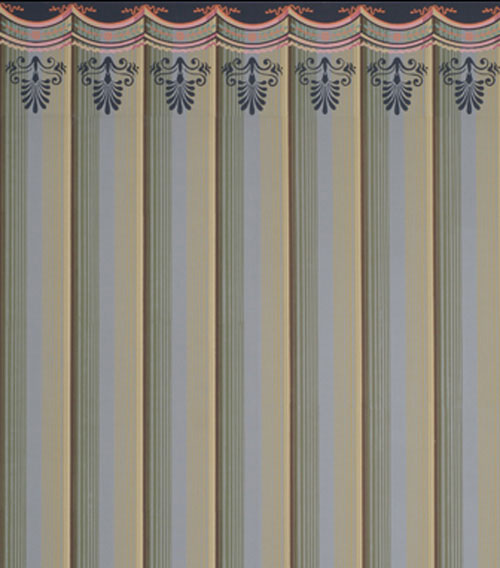
Because it's so classic, wallpaper of draped fabric has a very stylish, contemporary look.
Adelphi Paper Hangings is a company that hand blocks historic wallpapers, including colonial and Empire designs. The story of their custom designs is most interesting, and you can access them
here.
.......................................................
You'll notice a new feature on my sidebar — "Antique Button of the Month." Every month I'll be sharing a new button from my own collection. I hope you enjoy them — I think you'll find that Victorian buttons were amazingly detailed and jewel-like.


MArk, the wallpapers are just wonderful, evoking a bygone ere, that was full of splendour and symbolism. Even just a small piece of these papers framed and hanging on a wall would be wonderful!
ReplyDeletele sigh! it's all beautiful!
ReplyDeletemy first time to your site.. gorgeous images and postings.
ReplyDeleteall the best,
david john
YHBHS interiors : art
David, Lynne and David - thanks for visiting! I've always been in love with Zuber wallpaper, and now I can add Mader to my list. L'art de Vivre says that Mader produced hundreds of these Neoclassic designs between 1808 and 1823.
ReplyDeleteExcellent article. Very much admire the blog. Happy new year!
ReplyDeletePaul, thanks so much for the compliment, and for visiting! ...Mark
ReplyDeleteMark, these papers are extraordinary. I know I would want to leave the walls free of art (very out of character for me!) just so I could enjoy all the wonderful details. Also, the first two images are just mind blowing. Wow.
ReplyDeleteH.H.
Hi, H.H.! I loved the first two images as well, and I have another photo of the queen of Prussia's bedroom, which is just as cloth-heavy. One thought that did pass through my mind was that such rooms must have been (must still be) incredible dust-catchers!
ReplyDeleteHi Mark. Great post and beautiful images. I DLed them all! I just read in Martin Battersby's "Trompe l'Oeil" (a really great book btw) that Mader used "as many as thirty-five" blocks for these papers, "although in the majority of cases the average was about eleven or twelve". I had read about French scenic papers using way more than that, but Mader's thirty-five is impressive when you consider that his papers were quite monochromatic, and most of those blocks would have been very subtle value shifts of grey.
ReplyDeleteHi, Alan - I'll certainly look out for Martin Battersby's book. I've always been attracted to Mader's and Zuber's designs, and in particular, how they achieved great landscapes with layers of flatness.
Delete