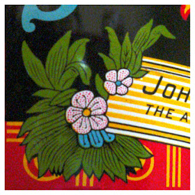
As a graphic designer, I'm always inspired by the colorful, exuberant packaging designs of the 19th century. The tobacco industry had some of the best designs and that's why, though I've never smoked, I've collected lots of tobacco advertising.
This is one of my favorite tins, Buckingham Bright Cut Plug Smoking Tobacco. While the design is from the 1800s, the actual tin is probably from the late 1920s. It's in remarkable condition.
The product was produced by the American Tobacco Company, which was founded by J. B. (James Buchanan) Duke in 1890. Duke acquired more than 200 competitors, in part because he quickly embraced a mechanical cigarette-rolling machine that other tobacco companies had shied away from. Within 20 years of its founding, the American Tobacco Company controlled approximately 80% of tobacco products in the United States. Then, in a process which began in 1907, the Sherman Anti-Trust Act reduced Duke's company to four separate tobacco companies.
In 1924, J. B. Duke endowed Trinity College of Durham, North Carolina with such a substantial gift that the college changed its name to Duke University in honor of J.B.'s father, Washington Duke.
.


Hello Mark:
ReplyDeleteWhat a remarkable tin and with such an interesting history attached. Perhaps this is a subject to which you may return at some point in the future with further examples from your collection? We rather hope so.
Hello, Jane and Lance - I will indeed share other tins in the future. Some time ago, though, I started pruning collections that took up space. It hasn't been an easy process, but there's also a good feeling about retaining only the best of the best! Now most of my collections are either flat or small, like paper, buttons and daguerreotypes. And these, of course, I'll share much more of. Thanks for asking!
ReplyDeletewow -that is in great condition - those bright brillant colors!
ReplyDeleteHi, Stefan - The interesting thing to me about looking at these brilliant colors and all the typography variation is that today's marketing departments would probably automatically nix such combinations.
ReplyDeleteI love the look of lithographed tin, especially when it has acquired a patina, as in your superb example.
ReplyDeleteThe combination here of typefaces, colors, patterns, inclines and degrees of curvature seems like an impossible-to-control nightmare, but they somehow coalesce perfectly, and the condition of the tin is the icing on the cake.
A gorgeous tin, Mark. I used to collect tins a while back. I have a few left, but not nearly so fine as what you've shown. Though now and then I got my hands on some pretty colorful and intriguing designs.
ReplyDeleteI love the color combos especially. And you're right, today they'd probably be thought not subtle enough or whatever.
I, too, would be interested in seeing more of your collections. I have been meaning to say how much I enjoy looking at the various designs on your right hand sideboard, Mark.
It is a beautiful tin. I agree, it would be too "busy" or cluttered for today's eye. I would love to see more.
ReplyDeleteHi Mark,
ReplyDeleteI love the clean, clear colors! The tin is in oustanding condition, too.
Love your posts. Your collections and knowledge are great! I always finish reading your posts and think to myself, "ah, I didn't know that" Thanks for the education Mark.
Mrs. D
Hi, Parnassus - As you might know, I've been collecting lithographed paper advertising for years, and this tin follows a style from about 1870 or 1880, 40 or 50 years older than the actual tin. My guess is that this tin design started out as a design for paper packaging from the same company.
ReplyDeleteHi, Yvette - Thank you for enjoying my sidebar icons. You are the first person to have commented on them, and I appreciate that very much. I'll be adding another page in about a week, one I think will be right up your alley!
ReplyDeleteHi, Theresa - There will be more tins to share, for sure!
ReplyDeleteThanks, Mrs. D, for the lovely comment! You made my day!
ReplyDeleteIt certainly is a wonderful tin, and what I like about your posts Mark, is that you fill us in with the history as well. I love tins! I have many. I loved the fact that they were a common part of everyday life, and are now collected
ReplyDeleteHi, David - Well you know, I love show-and-tell, and for everything shown, there just has to be a good story. I read your comment and wondered whether you still have tins from your childhood in Australia, and how they might be very different designs from what I was used to as I was growing up?
ReplyDeleteA lovely colourful tin - so many different lettering combinations have been used, but somehow the tin can take it. There is even a nod to your favourite 'Greek Keys'.
ReplyDeleteHi, Rosemary - You are right, the decoration on the bottom looks like a stylized frieze from antiquity, doesn't it?
ReplyDeleteWow, great tin! I have quite a few tins myself, but few that are actually old. The neatest one is my "Doyon Honey" tin with images of bees and rocket ships:
ReplyDeletehttp://img.photobucket.com/albums/v473/sooth15/LiveJournal/DoyonHoney1.jpg
http://img.photobucket.com/albums/v473/sooth15/LiveJournal/DoyonHoney2.jpg
http://img.photobucket.com/albums/v473/sooth15/LiveJournal/DoyonHoney3.jpg
Hi, JC - I visited the images of the Doyon Honey can and would add that it is beyond neat — it's also funny and charming and strange! It's as if the honey company owners had gone to a sci-fi illustrator for their marketing. what a great find!
ReplyDeleteHi Mark
ReplyDeleteWhat do you put in your beautiful tin?
Anyes
XX
Hi, Anyes - I've found that the Buckingham tin is perfect for a large assortemnt of rubber bands!
ReplyDelete