This week I'm painting two inset panels on either side of my hallway portal. I've looked at the space for years, thinking that it was a prime spot to make an interesting statement. I thought alternately of painted figures or three-dimensional totems. Ultimately, I chose the two panels that are featured in the painting below.
 |
| click to enlarge | The Art of the Italian Renaissance | Ullmann |
This is a c. 1480 portrait by Melozza de Forlì of Francesco della Rovere, also known as Pope Sixtus IV. Sixtus is shown with his librarian and four nephews. It's appropriate that Sixtus IV is immortalized with the nephews because he was known for nepotism and, in fact, he made six of his nephews cardinals! Indeed, it is no coincidence that the word "nepotism" is derived from the Italian word for nephew,
nipote. While the subject of this lovely painting established the Sistine Chapel, he was corrupt, and history remembers him unkindly.
Though he was a fine artist, little is known of de Forlì, in large part because he was overshadowed by the next generation of Italian artists, which included Michelangelo. We do know that de Forlì worked for Sixtus IV, and that he was responsible for the frescoes in the Vatican library.
 |
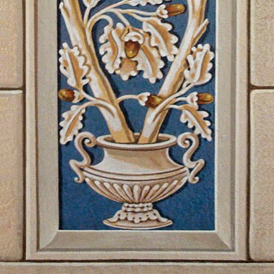
| click to enlarge | sources below |
In the image above,
the center decoration is by Benozzo Gozzoli,
Benozzo Gozzoli | Scala/Riverside
The first and third pilasters are by
Filippino Lippi and Pinturicchio respectively,
Italian Frescoes | Abbeville Press
In my research, I've discovered a number of Renaissance frescoes that utilize cobalt blue pilaster decorations.
While the Egyptians were known to have developed a synthetic cobalt blue, the formula was lost to later cultures, who ground lapis lazuli to create the rich color. And so it is no wonder that Renaissance artists would concentrate the expensive color in a prominent yet narrow part of a fresco.
My approach to decorative art such as this mural — or the
Egyptian door I shared earlier — is usually through draftsmanship. I like to carefully work out everything in advance, sometimes making multiple tracings. I then transfer a design by burnishing it from the tracing.
That way, as you can see, I have a record of my designs, should I need to refer back to them or reuse them.
 |
| click to enlarge |
The finished doorway.
 |
| click to enlarge |
Now I'm going to put away the masonry tools for a while and get back to that beam that unites all my columns. Next week we'll be adding a little dimension there to transform it into an entablature.
.


Hello Mark:
ReplyDeleteWe very much like the way in which you have used the portrait of Pope Sixtus IV as the inspiration for your door surrounds which firmly places them within a context as well as, of interest, we think, giving to them some form of narrative. The cobalt blue is a most striking colour.
Kellemes húsvéti únnepeket!
Hello, Jane and Lance:
DeleteThank you for providing me with two terms I was missing — "door surrounds" and "narrative." I've just revised the posting's title to say door surrounds, and as you have aptly observed, it is the narrative of this project that gives me as much pleasure as the actual finished piece.
I look through many fine interior design magazines and see absolutely beautiful rooms which still leave me feeling cold. And it is because they don't have a narrative, especially something to reflect the owners' own lives and passions. I want my place to have many stories and be full of surprises!
And Happy Easter to you, too, Jane and Lance!
DeleteYou are doing amazing work, Mark!!! The oak leaf and acorn panels are stunning. I love that intense blue. Have a wonderful Easter weekend, Loi
ReplyDeleteHi, Loi - That intense blue actually takes on a little more vibrance by being paired with the Tone on Tone grays. :o) Have an enjoyable Easter weekend!
DeleteThis is gorgeous, Mark! I love the acorn and leaves pattern. I like a house full of intelligent surprises myself. If your house doesn't reflect your own individual tastes and interests - then what's the point? This is wonderful work, I must say.
ReplyDeleteAnd I will add: Have a Very Happy Easter.
Thank you, Yvette! I toyed for a long time with 3-D sculptures that would also serve as sconces, but in the end, it all boiled down to the fact that I love trompe l'oeil.
ReplyDeleteHappy Easter to you — I hope it includes an egg hunt with your two beautiful grandchildren!
Hello Mark, I like the way you have introduced this new color, and how a tension is starting to develop between the horizontal and vertical bands of color. They really enhance the doorway, both leading the eye, and indicating the flow of traffic.
ReplyDeleteI have a doorway here flanked by narrow, tall panels, framed in black, and with a gilt and black design on a red ground. They are just floating on a white wall, but still give the doorway a certain substance, although not to be compared to your brilliantly executed composition.
--Jim
Hello, Jim,
DeleteI can imagine the panels that you've described, and the dramatic statement they must make. I also imagine that the panels pick up many of the same colors of carefully chosen artifacts that are displayed around them.
As I have intimated in other comments, the Pompeii Room is going to become increasingly more complex in design, so each new color that's introduced will have some degree of balance. You can be sure that the cobalt blue will find its way into those auburn panels.
Dear Mark, A brilliant idea you have come up with, making the cobalt blue a major design element. Will there be a little (or a lot) of gold leaf? Watching your progress is fascinating. I'm glad that you have not revealed your master plan...this way we can anticipate. It is so delightful when you surprise us with another and unique design idea.
ReplyDeleteHappy Easter Sunday.
Dear Gina,
DeleteAre you kidding? There will be tons of gold, just for you! Seriously, after the background colors, I imagine that gold will be the predominant color, and you'll start to see it soon. I'm glad you approve of the long tease!
Happy Easter Sunday to you and Gene!
pretty nice blog, following :)
ReplyDeleteThanks for visiting . . . :o)
DeleteMark,
ReplyDeleteFor some reason I"m surprised to see this oak leaf and acorn pattern from a painting from the 1400s. I always associate it with the Vanderbilts although I was pretty sure they didn't invent it. I notice the capitals and bases on these two columns are slightly different. I'm there's some purpose for that that will become evident later. This is fun to watch your progress!
Hi, Steve,
DeleteI hope you've had a good Easter weekend.
George Vanderbilt spent a number vacations in Europe, starting when he was 10, and before building Biltmore, he toured again with his architect William Morris Hunt. The purpose of their tour was really to catalog those things Vanderbilt liked best with the intention of incorporating them into the eventual Biltmore. I have no doubt that they copied the acorn design from that European tour, and it's quite possible that they were inspired by the crest of Pope Sixtus IV (1471-1484), which was a tree of acorns. Pope Julius II (1503-1513), under whom Michelangelo served, used the same crest, and Vanderbilt would have seen it often if he was in Rome.
In my research of ancient stone facades (for my own masonry), I was quite taken with buildings that had irregular stonework. I incorporated a little irregularity into my stonework on a whim, and you'll notice that halfway up the right panel is one stone that almost looks like a patch. There's nothing to say that these stones were all layed at the same time.
Thanks for enjoying the progress!
Good morning and what wonderful progress you are making. Again, I am so appreciative of that top-view image you provide so that those of us who cannot picture things have an idea of what is really going on. I love the addition of the cobalt and being a bit of a word nut, I'm intrigued by the origins of "nepotism!'
ReplyDeleteHi, Barbara,
DeleteI too am a lover of words and their sometimes unusual origins. Did you know, for example, that the Romans would buy small statues of various gods to keep within their homes — household gods, you might say. Ones that were less well made would be hollowed and filled with wax, rather than solid. So the careful shopper of idols would look for one that was "without wax" or "sincere."
No, Mark, I didn't know this wonderful tidbit and am happy that situation is now rectified. I am killer at Jeopardy because I love this sort of thing! So If I ever hit the big time, I'll remember some of my "sources!"
Deleteoh these are fabulous - great too that you keep a record of the 'originals'.
ReplyDeleteHello, Stefan,
DeleteSome years ago, I had California Closets rebuild the inside of the closet in the master bedroom which I've always used as an office/studio. They designed a deep drawer that is actually a pull-out bin, and in it I keep tube after tube of rolled up tracings.
I don't think you could have picked a better source for your door surrounds. I love your use of blue, some people do not use it correctly and put way too much of it in a composition not knowing that costs kept its use historically to small accent areas. Your response to Gina was funny! I too, look forward to all the gold!
ReplyDeleteDear Theresa,
DeleteI'll be introducing cobalt blue into other areas of the mural, but they'll be small accents. I'm sure that you of all people can relate to how much pleasure I'm deriving from the research that goes into this project!