Chapter 1: How It Came To Be
I live in a small house with a dining room merely 10x7½ feet. When I
bought the house, the last owner's rather large dining table was still
there, and it seemed to me as if it would almost be easier to walk
across the table than around it! And because I prefer to dine out
anyway, I kept the space bare, using it as a walk-through and calling it
"The Great Hall."
There would be those days, though,
when I'd have supper off a TV table in the living room, and ponder the
empty space. It wasn't as starkly bare as it looks above — I had an
antique chest of drawers against that yellow wall, and over it, a
handsome collection of framed lithographs. But I'd look at the room and
think, "I really should do something more creative with that space!"
Then one birthday, my friends Sandy and Greg gave me an inspiring book,
Ca'Toga, by
Carlo Marchiori.
Marchiori is an amazing decorative artist who found great success as a
muralist. He built a splendid house in the Napa Valley, and created a
magical world within it.
 |
| Carlo Marchiori's living room |
|
|
How's this for a living room?!
I was greatly inspired by Carlo Marchiori, not just because he's an
incredibly accomplished artist, but because he also has a bold vision.
His book got me to thinking about the possibility of painting a mural in
my dining room. That in itself was a bold vision for me because I
usually paint on a small scale; I could easily have been the fellow
painting portraits on ivory or designing bank notes.
You may have noticed that when you have a good idea — or discover
something excitingly new — the Universe has a way of conspiring to
remind you of it at every turn. As I pondered the possibility of a
mural, my New York friend Yvonne sent me a bulletin from the
Metropolitan Museum of Art. It was on the great Andrea Mantegna, who
ranks as my favorite Renaissance artist.
 |
| Metropolitan Museum of Art Bulletin | Fall 2009 |
Mantegna is probably best remembered for creating (some time between
1465 and 1474) one of the earliest trompe l'oeil masterpieces, a painted
oculus for the palace of Ludovico Gonzaga of Mantua.
 |
click to enlarge | Metropolitan Museum of Art Bulletin | Fall 2009
|
Here's a detail view of Ludovico Gonzaga's family and court, from a wall
of the same room. Mantegna was so well respected for his work that the
Gonzaga granted him armorial bearings.
 |
| Metropolitan Museum of Art Bulletin | Fall 2009 |
I am especially enamored of a series of paintings Mantegna painted entitled,
The Triumphs of Caesar.
They were acquired from the Gonzaga by Charles I of England and now
reside at Hampton Court. Like the others of the series, this painting
measures approximately 9x9 feet.
No sooner had I digested the bulletin on Mantegna than Yvonne sent another Metropolitan Bulletin, this one on Pompeii.
The Metropolitan Museum of Art has done a wonderful favor to lovers of
Antiquity by taking Pompeian frescoes that have been scattered to
museums all over the world and reuniting them in virtual rooms.
 |
| Metropolitan Museum of Art Bulletin | Spring 2010 |
Those rooms still sing out in rich and amazingly vibrant color. I look
at rooms like this and find it funny that despite all our technology and
sophistication, so many of us timidly cling to white and beige walls. I
say, don't be afraid to experiment with color — after all ... it's only
paint!!
Then I had an epiphany! As I studied all those great Pompeian frescoes, I
recognized that so many of them were divided by columns into panels.
And I realized that if I divided my dining room into panels in the same
manner, no matter how much time I spent on the mural —or how many breaks
I took from it — the mural would look finished at every stage! In my
mind, I was halfway finished before I had begun!
So Pompeii it would be!
Now before we get started, I want to share some great rooms with you in
the next posting, rooms that have inspired me. Some are Pompeian, some
have descended from Pompeian style, and some are more generically
Neoclassic. When you see them, you'll have a hint of what I had in mind.
Chapter 2: Rooms That Inspire
 |
| Ca'Toga | Carlo Marchiori | Ten Speed Press |
In this posting, I'm going to share images of several rooms that have
been an inspiration for the creation of my Pompeian dining room.
Carlo Marchiori's Pompeian room at Ca'Toga (above) is a masterpiece of
Pompeian imagery. Not only is it a technical tour de force, but it shows
his complete immersion in the history and symbolism of Pompeian times.
The bright reds and stark blacks that we've come to associate with
Pompeii can be found in many villas there, most notably in the Villa of
the Mysteries.
 |
| Alan Dodd | Grand Illusions | Phaidon |
Long before I discovered Carlo Marchiori, I was inspired by this cool,
elegant Greek room. It was painted by Alan Dodd in the early 1980s. I
think the combination of creamy colors with that pastel green is a large
part of its attraction, and note that the wainscoting is a subtle
complementary green.
 |
| Pompeii | Coarelli | Riverside |
In fact, what I think of as a painted wainscoting is a Pompeian design
element that I want to incorporate into my own room. Above is an image
from the House of the Vettii, in Pompeii. What a gorgeous color scheme!
 |
| Antiques in Italian Interiors | Roberto Valeriani, Mario Ciampi | Verbavolant |
This room from Palazzo Milzetti, Fainza, Italy, is a little too busy for my taste, but I am
inspired by in awe of the detailing.
 |
| Antiques in Italian Interiors | Roberto Valeriani, Mario Ciampi | Verbavolant |
A close inspection (I got out my magnifying glass) reveals an artist who
was so familiar with anatomy and other natural forms that his work
appears to be akin to effortless sketching.
 |
| Neoclassicism in the North | Håkan Groth, Fritz von der Schulenburg | Rizzoli |
I would be very happy to inhabit this 1790s room, which was an inner
salon belonging to Prince Fredrik Adolf of Sweden. But while I
appreciate it's delicate refinement, I'm looking for a bigger color
statement.
 |
| Neoclassicism in the North | Håkan Groth, Fritz von der Schulenburg | Rizzoli |
This gorgeous room also belonged to Prince Fredrik Adolf, though in a
different castle. The late Duke of Devonshire had similar decoration in
his private study at Chatsworth. It was his favorite room there, in part
because it was also the smallest!
 |
| Antiques in Italian Interiors | Roberto Valeriani, Mario Ciampi | Verbavolant |
This room is not Pompeian, but the fantastic architectural construction
has some of the feel of Pompeian mural decoration. It's from the Villa
Godi (1537), one of Andrea Palladio's fist architectural designs.
Appropriately, the figure sitting in the alcove is reputed to be the
young Palladio.
 |
| Neoclassicism in the North | Håkan Groth, Fritz von der Schulenburg | Rizzoli |
The Grand Salon belonging to King Gustaf III of Sweden is considered by many to be the finest Pompeian-style room in Europe.
 |
| www.visitthecapitol.gov |
In the United States, one of the finest Pompeian rooms is the private
meeting room of the Senate Appropriations Committee. It was painted in
the 1850s by Constantino Brumidi, who was the artist also responsible
for the decoration inside the Capitol dome.
Those are some of the many rooms I studied to draw inspiration for my
own Pompeian room. In my next posting, I'll begin painting, but this
would be a good time to pause and clarify a thought that is bound to
cross your mind as you watch the progress of my room:
Chapter 3: Starting to Paint
 |
| en.wikipedia.org/wiki/Domus |
As I looked at images of Pompeian-style rooms, I wanted to pick
authentic colors that went beyond the typical Pompeian red and black. I
also wanted a painted wainscoting, and I spent a lot of time studying
the room pictured below.
 |
| Karl Friedrich Schinkel | Bergdoll | Rizzoli | photograph by Erich Lessing |
I like that deep red color and how it's combined with green, and I like
the illusion of panels on the wainscoting. You might be wondering which
monarch occupied this room. It was designed between 1829 and 1833 by the
great German architect Karl Friedrich Schinkel, and it was actually
part of the Court Gardener's House, in Prussia.
 |
| Metropolitan Museum of Art Bulletin | Spring 2010 |
The colors that I finally settled on are a nod to the Pompeian villa of
P. Fannius Synistor. This particular panel can now be viewed in the
Louvre. Part of my attraction to this image is the paneling delineated
by fine lines of highlighting and shadow. a typical Pompeian style. I'll
definitely incorporate that look.
My colors are Sherwin Williams Paints, and they break down as follows:
- Vast Sky (for the top of the mural and ceiling)
- Insightful Rose (for architectural elements)
- Arresting Auburn (for the top of panels)
- Alaea (for the bottom of panels)
- Butternut (as the base color for golden ornamentation)
- Lounge Green (for the top border of the wainscoting)
- Ablaze (for the wainscoting)
The colors will be combined to look like the simplified layout below. Of
course there will be many layers of decoration overlaying this scheme!
I began by determining the top edge of the wainscoting, and I drew that
line with a level. Experience has taught me the hard way not to measure
up from the floor, or down from the ceiling. By establishing a level
line and working from that, [almost] everything will be nicely squared.
My living room has two walls of bookcases with cabinets beneath, so it
makes sense to have the top edge of the wainscoting be level with the
top of the cabinets.
As you can see, there is some texture to the wall, but it is regular
enough so that I didn't feel the need to resurface the wall. (The walls
of Pompeian murals, however, were very smooth.)
I'll have you know I painted those lines by hand! For a long time I've
had an aversion to taping because the paint always seemed to bleed, or
I'd pull up the paint that was already down. But after painting that
green line, I realized that not using tape was an exercise in madness.
It pays to ask experts for advice, and I was directed to this green Frog
Tape, which is made especially for taping rougher surfaces like stucco,
concrete and brick. The only thing I did that isn't covered in the
instructions was to burnish about 1/8" along the very edge of the tape.
It's been working like a charm.
Here's a slightly blurred photo of the room at the very beginning of the
project. Not to worry, I'll be showing lots of clear details as we go
along.
That white baseboard doesn't look good sandwiched between the red paint
and the gray carpeting, does it? If I paint it a slightly darker gray,
it should look nicely tailored.
In my next posting, I'll concentrate on painting around that window. I
have an idea for it that's been tucked away in my memory banks for a
long time.
Chapter 4: Painting Around the Window
In my last posting, I shared the Pompeii Room's color scheme with you.
If it were possible to remove the roof from the house and look down into
the room, it would look like the image below.
"A" leads to a hallway and
the griffin overdoor
I posted about on February 24th, "B" leads to my kitchen, and "C" is a
window that looks out into my back yard. I'll paint the areas that are
colored tan to look like masonry, and that way I think the doorways will
make more sense to the rest of the mural.
As I walk through my front door, I face the window, and so I thought it
would be important to tackle that rear wall first. There's a 9½" space
above the window, and that could make a window frame look a little
top-heavy. But the space is also perfect for a
torus.
A
torus is simply a rounded moulding, but it is most often associated with this design, which is an oak torus.
I'm painting the torus in a rather loose way because I want to give a
little momentum to the project. I'll come back later and define those
leaves and acorns better, and darken the shadows. I'll also come back at
the end of the project and put colorful marble in the plaque, and an
inscription. For now, anyway, the window is presentable.
As this photograph was taken, I was repairing a little water damage to
the ceiling, so it wasn't painted blue yet. The window also boasts
venetian blinds that detract from the illusion of Pompeii, so until I
come up with an appropriate window treatment, I'll PhotoShop-mask the
window in gray.
Speaking of PhotoShop, the computer is an important tool in the whole
process, and in ways that the casual observer would never guess. For
example, the ceiling rises approximately ¼" on the right, meaning that
my oak torus would have a disturbing gap above it on one side.
However, in PhotoShop I can skew the whole design just a tad so that the
torus will fill and correct the space in an imperceptible way (unlike
the exaggerated example above).
The window frame itself is looking three-dimensional, less for the
rendering of stonework than for the shadowing, which gives the
appearance of the shadow changing according to the different colors
"underneath."
Since my last posting, I've also painted the baseboards a gray that
complements both the carpeting and the Greek key. I talked about that
Greek key in an early blog posting,
here.
The design comes from an Irish castle, and I hand-painted it throughout
much of my house. That required many hours lying down on the job, with a
curious pet rabbit nearby, wondering what I could possibly be doing!
Here's the Pompeii Room as it looks today. As you can see, the ceiling
is now all blue, and I'm pleased with the progress of the window wall.
Now I can concentrate on blocking in the rest of the base colors.
Next week I'll be painting the columns and the frieze that connects
them. The columns, which are very particular to Pompeian design, might
be unlike any you've seen before!
Chapter 5: Painting the Columns
This week I'm painting the columns of the Pompeii Room. My versions are
squared and would have four or maybe three sides in reality, so they
would more properly be called
pilasters.
 |
| The Metropolitan Museum of Art Bulletin, Spring 2010 | www.findamuralist.com |
The Pompeians often decorated with an unusual form of column that had,
for lack of a better way to describe them, square plugs. I've been
looking for the origin and meaning of such columns, and have yet to
discover any information that would help to illuminate. Perhaps one of
my clever readers can fill in the blanks. At any rate, I've looked at
this element and decided that adding it to my own room would lend a
distinctly Pompeian air.
On the left is a fragment from the villa of Publius Fannius Synistor (it
can be viewed at the Metropolitan Museum of Art), and on the right is a
fragment of the South Porch of the Getty Museum in Los Angeles. It's
the work of the brilliant muralist, Garth Benton.
Some of the folks who have seen the room at this early stage are
interpreting the auburn color as a brown, but it is in fact a deep
purple. The shadows that are falling from the "plugs" — just as they do
in Mr. Synistor's house — are that very same auburn with white paint
added. They become a lovely mauve.
My choice is to not show the sides of the pilasters, and all the extra
plug shapes, because so much more is going to happen within those auburn
panels. (Sometimes in art the suggestion of something is sufficient,
and besides, I can take a little artistic license here.)
I have, however, added dimension to the frieze. It would look strangely
flat without that lip, and who knows, I might want to hang some Pompeian
goodies from it a little later.
Since my last posting, I've installed track lighting on the ceiling. The
lights are not necessarily a final solution, but for the time being
they'll help me focus wherever I'm painting at the moment.
 |
| click to enlarge |
Here's the Pompeii Room as it looks today. In my next posting, I'll add
capitals to the columns, a look that would make P. Fannius Synistor feel
right at home.
Chapter 6: The Ionic Capitals
In last week's posting, I painted columns (pilasters, actually) in the
Pompeii Room, and now it's time to crown them with capitals.
One of my great pleasures in the process of painting this room is in
looking through many art reference books and choosing the elements for
the room as though I were actually building a house. And how delightful
to know that whatever I do end up choosing will be in stock, as long as I
can paint it!
I chose the Ionic capital (above) for an interesting reason. My first
choice would have been a Corinthian capital, like the one below:
You can see, however, that the classic Corinthian capital is twice as
deep as the Ionic one. As I did my visual calculations, I quickly
realized that because the columns don't go all the way to the floor, and
are in fact short, the preferred capital would make them appear
downright squat. And that would never do!
There are six capitals to be painted, and several shades of auburn and
mauve to be mixed, so my approach is to paint all six capitals
simultaneously. As I paint one element of a capital, say that
highlighted line that goes through the middle, I paint the same
highlight on all of them.
That way, all six capitals look like this, with very little variation.
 |
| click to enlarge |
Here's the Pompeii Room as it appears today.
On the left you can see a block of yellow, which was the original color
of the room. In my next posting, we'll turn that into masonry, working
our way around the hallway door.
Chapter 7: Painting the Hallway Masonry
 |
| Mark D. Ruffner |
|
|
This week I'm concentrating on painting the masonry that will surround the doorway to my hall.
Originally, I had contemplated stonework that was aged and maybe even a
little decayed, but in the end, I didn't want an element that would
contrast with the freshness of the rest of the mural. Anyway, my Pompeii
is not the one of ruins!
I realized, however, that the actual texture of the wall could be used
to advantage, to create a rich, subtle underpainting of stone
(limestone, perhaps). I started by putting light washes of earth tones
on the wall. Then I rubbed away selected areas with a scouring pad.
Once that was done, I redrew the lines representing cracks, and repeated
the process numerous times. While all this scrubbing created a pretty
nifty stone texture, the look at this stage was not in keeping with the
rest of the mural. Not to worry; I added several light washes to
approximate limestone.
In making the stonework lighter, one of my goals was to make the stone
and columns close in color value. Because the design is going to become
increasingly more complex, it will be all the more important for each
element to complement the next one.
The finished, more subtle result can be seen below.
Then it became a matter of adding the cracks, with their shadows and
highlights. I did this several times. On my first try, I played around
with chips and all sorts of unevenness in the lines (like the first
photograph of this posting). I quickly discovered that the more regular I
made my blocks, the more convincing they were. So most of my
irregularities are small ones, at the corners of the blocks.
I'm not showing you the whole doorway surround for a good reason. Next
week I'll be painting a panel on either side of the doorway, as though
they're inset. They aren't Pompeian panels, but they'll complement the
Pompeian design.
No, these are decorations that a man named Francesco della Rovere would have recognized.
Chapter 8: The Cobalt Door Surrounds
This week I'm painting two inset panels on either side of my hallway
portal. I've looked at the space for years, thinking that it was a prime
spot to make an interesting statement. I thought alternately of painted
figures or three-dimensional totems. Ultimately, I chose the two panels
that are featured in the painting below.
 |
| click to enlarge | The Art of the Italian Renaissance | Ullmann |
This is a c. 1480 portrait by Melozza de Forlì of Francesco della
Rovere, also known as Pope Sixtus IV. Sixtus is shown with his librarian
and four nephews. It's appropriate that Sixtus IV is immortalized with
the nephews because he was known for nepotism and, in fact, he made six
of his nephews cardinals! Indeed, it is no coincidence that the word
"nepotism" is derived from the Italian word for nephew,
nipote. While the subject of this lovely painting established the Sistine Chapel, he was corrupt, and history remembers him unkindly.
Though he was a fine artist, little is known of de Forlì, in large part
because he was overshadowed by the next generation of Italian artists,
which included Michelangelo. We do know that de Forlì worked for Sixtus
IV, and that he was responsible for the frescoes in the Vatican library.
 |
| click to enlarge | sources below |
In the image above,
the center decoration is by Benozzo Gozzoli,
Benozzo Gozzoli | Scala/Riverside
The first and third pilasters are by
Filippino Lippi and Pinturicchio respectively,
Italian Frescoes | Abbeville Press
In my research, I've discovered a number of Renaissance frescoes that utilize cobalt blue pilaster decorations.
While the Egyptians were known to have developed a synthetic cobalt
blue, the formula was lost to later cultures, who ground lapis lazuli to
create the rich color. And so it is no wonder that Renaissance artists
would concentrate the expensive color in a prominent yet narrow part of a
fresco.
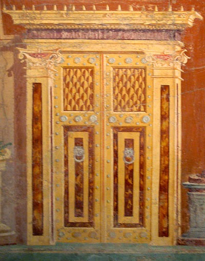
My approach to decorative art such as this mural — or the
Egyptian door
I shared earlier — is usually through draftsmanship. I like to
carefully work out everything in advance, sometimes making multiple
tracings. I then transfer a design by burnishing it from the tracing.
That way, as you can see, I have a record of my designs, should I need to refer back to them or reuse them.
 |
| click to enlarge |
The finished doorway
 |
| click to enlarge |
Now I'm going to put away the masonry tools for a while and get back to
that beam that unites all my columns. Next week we'll be adding a little
dimension there to transform it into an entablature.
Chapter 9: Making the Entablature
This week I'm focusing on the structure that connects my columns, creating an entablature for the Pompeii Room.
It's really easier to explain an entablature by showing you a diagram.
The cornice is the topmost moulding, which can be quite elaborate.
Cornice
is also the word used for the moulding — inside one's house — that runs
around the top of a wall, right below the ceiling. The frieze is
directly under the cornice and takes up the greater part of the
entablature. It's the surface that is often used for incised
inscriptions. And finally, the architrave is a base moulding, and the
space beneath it.
 |
| en.wikipedia.org |
Many classical buildings, like the full-scale Parthenon in Nashville,
Tennessee, have an entablature with an architrave almost equal to the
frieze.
 |
| Jefferson's Monticello | photograph by Langdon Clay | Abbeville Press |
My own preference is for a more generous frieze and a reduced architrave, as Thomas Jefferson used for his home, Monticello.
I suppose one could dispute whether my two top mouldings actually
constitute a true cornice, but the proportions of my entablature are in
keeping with many classical buildings.
This part of the project looks deceptively simple, but it took
a lot of measuring, taping and retaping.
Notice the vertical shadow I've added to the entablature, as though the entablature is slightly behind the masonry.
Next week I'll be decorating the frieze. I haven't settled yet on any
particular form of decoration, so I'm having fun looking through books
on Pompeii for inspiration.
Chapter 10: Painting the Frieze Scroll
 |
| Wallpaper: A History of Styles and Trends | Carolle Thibaut-Pomerantz | Flammarion |
I decided to decorate my frieze with a scroll, and this design caught my
eye as the sort of look I wanted to achieve. It's a detail from an 1808
wallpaper design by the French company Dufour. Looking at the image
below, you can see that the wallpaper design accurately reflects a
Pompeian temple frieze.
 |
| Pompeii | Coarelli | Riverside |
This was a small temple in Pompeii, dedicated to Aesculapius (
Asclepius
in Greek), the god of medicine and healing. Aesculapius was a son of
Apollo and carried the snake-entwined rod that remains the symbol of
medicine to this day.
 |
| Pompeii | Coarelli | Riverside |
Here's a scroll from a Pompeian interior mural. It comes from the salon
of the House of the Painters at Work, so called because evidence
suggests that the eruption of Mount Vesuvius interrupted a mural in
progress.
 |
| The Grammar of Ornament | Owen Jones | Portland House |
Owen Jones published
The Grammar of Ornament in 1856, and
included this frieze design from Pompeii. He wrote of it, "We have here
the acanthus-leaf scroll forming the groundwork, on which are engrafted
representations of leaves and flowers interlaced with animals, precisely
similar to the remains found in the Roman baths, and which, in the time
of Raphael, became the foundation of Italian ornament."
 |
| Florid Victorian Ornament | Karl Klimsch | Dover |
I settled on this scroll, which is simpler and more refined than the
others I've shared. It's a design by the German artist Karl Klimsch
(1867-1936), a portrait painter who is widely known today for his
ornamental designs, reissued by Dover Publications.
Here's the room as it appears today.
In my next posting, we'll take a look at that brown circle on the far
right of the photo above. A good Pompeian mural wouldn't be complete
without it!
Chapter 11: The Clipeus
 |
| Mark D. Ruffner |
This week I'm adding a clipeus to the Pompeii Room.
 |
| The Metropolitan Museum of Art Bulletin | Spring 2010 |
The
clipeus was a shield that was hung by the Pompeians over
their entrances for protection. Today, some people do the very same
thing with horseshoes. This mural detail is from the house of P. Fannius
Synistor, and can be seen at the Metropolitan Museum of Art.
 |
| Pompeii | Coarelli | Riverside |
This is a detail of a mural from the Villa Poppea. Though it's not in P.
Fannius Synistor's house, the clipeus looks as though it may have been
painted by the same artist.
 |
| www.findamuralist.com |
The late Garth Benton, who painted this clipeus on the south porch of
the Getty Museum in Los Angeles, probably looked to the first two images
for reference. Notice that all three shields include the same star.
 |
| Mark D. Ruffner |
It's a star found on many shields from antiquity. We know that the
Romans borrowed heavily from the Greek culture, and this star can be
traced to Macedonia, which was originally a Greek city state.
 |
| en.wikipedia.org |
Appropriately, prior to 1995, this was the flag
of the Republic of Macedonia.
 |
| squarewithflair.blogspot.com |
Having said all that, I decided to go a different route and decorate my
clipeus with a lion's head. I was attracted to this Chanel logo — the
photo originated from my blogger friend at
Square With Flair.
Chanel, who was a Leo, loved the lion as an emblem, decorated her
apartment with lions, and even incorporated the lion on buttons for her
fashion creations. Terry was kind enough to send me additional reference
of this particular lion.
And here is my own clipeus.
Next week I'll be adding a mythical animal to the mural,
one that represents both strength and wisdom.
Chapter 12: A Griffin for the Entablature
 |
| modified for this posting from a more detailed engraving by Wenceslas Hollar, 1600s |
This week I'm adding a griffin to the top of the entablature — I think
an element is needed to break up the entablature's straight line.
The Pompeians used the griffin in their murals, but this mythical
creature goes back thousands of years, to India, Assyria and Persia.
I'm starting the posting with this 17th-century engraving because it's
true to what a griffin should look like. The creature is basically the
combination of an eagle and a lion. The head and front of the body —
including the front legs and wings — are represented by an eagle. In
addition, the eagle head features long ears that are sometimes
feathered. The rest of the body belongs to a lion. Altogether, the
creature symbolizes strength and wisdom. Because the griffin
traditionally guards treasure, he also symbolizes vengeance; I think
he's perfect for my home security.
 |
| Mark D. Ruffner, 2014 |
Sometimes the griffin is represented more as a winged lion, as in this
mirror detail from the Vinoy Hotel in St. Petersburg, Florida. In that
case it's not really a griffin, though it might be more aesthetically
pleasing.
The griffin is going to be at the end of the entablature,
so that he can survey the entire structure.
I begin the painting by putting down a flat color, either a middle tone
or the prevailing color. Note that I am conscious of making the
griffin's base equal to the capital's cap, and that together they form a
square. I have two goals here — first, to have elements align so that
as the composition becomes more and more complex, the eye unconsciously
recognizes order. And second, though the griffin rests atop the
entablature, there is a sense that he's also atop a column, not unlike
the winged lion of Venice, below.
 |
| 209postcards.files.wordpress.com |
Here's the finished griffin. His front legs are from a lion and he
doesn't look particularly vengeful, but I'm confident that he'll still
be an effective guardian.
Next week we'll start working inside those auburn panels, and the room will take a big step towards looking more Pompeian!
Chapter 13: Adding the Garlands
 |
| The Metropolitan Museum of Art Bulletin | Spring 2010 |
Many Pompeian villas had murals that featured garlands, and we must
assume that for festive occasions, real garlands were hung as well. The
garland above came from the house of P. Fannius Synistor, whose color
scheme I've adapted to my own Pompeii Room.
According to the Metropolitan Museum of Art, where the mural fragment
resides, this garland celebrates the god Bacchus. The bull's head
represents a real one that would have been used as sacrifice. If you
look closely you can see that a strand of pearls adorns its horns. The
bearded satyr head represents a mask, a snake rises from a cista
mystica, which was used in Bacchic initiation rites, and on the far
right is a cymbalum, used to make Bacchic music.
 |
| The Metropolitan Museum of Art Bulletin | Fall 2009 |
In
Pompeii No. 1, I mentioned that Andrea Mantegna ranks as my
favorite Renaissance artist. He and many other Renaissance artists
employed garlands in their paintings, doubtlessly as a nod to Ancient
Greece and Rome, for to be an intellectual during the Renaissance was to
be immersed in Classicism. Above is a detail from Mantegna's ceiling in
Mantua's Palazzo Ducale.
 |
| The Metropolitan Museum of Art Bulletin | Fall 2009 |
Here's a detail from Mantegna's altarpiece from the Church of San Zeno,
in Verona. I've chosen it as the source for my Pompeian garlands. I'll
start on my wall with the center garland, under the clipeus, and I'll
use the garlands that are surrounded by the white box above.
 |
| click to enlarge | I Maestri del Colore: Mantegna | Alberto Martini |
Here's what they look like enlarged. One of the things I like about
Mantegna is that he brought the same eye for detail to absolutely every
inch of his paintings.
What I have to be conscious of is that the central garland will be a
different shape than the others, though at the same scale and hanging
depth. And if I keep the clipeus garland's foliage in scale with the
other garlands, I will need to invent extra foliage to "span the gap" at
its center.
 |
| L'Art de Vivre | The Vendome Press |
I started painting my garlands in greens and reds, as Mantega had, but
quickly realized that the ones with auburn backgrounds wouldn't pop out
as much as I would like. As I've said before, it's only paint, and I
started over. I looked at this handsome book cover, which features a
19-century French wallpaper design, and realized that it was a bolder,
more effective garland for my purposes.
 |
| click to enlarge |
Here's the first garland finished. Next week, we'll take a look at the
remaining garlands, also based on Mantegna designs. I hope you'll check
back then!
Chapter 14: The Remaining Garlands
Last week, I painted the central garland in the Pompeii Room. This week, I'm finishing the remaining three.
In order to keep things simple, I'll just call them Garlands A, B and C.
 |
| The Metropolitan Museum of Art Bulletin | Fall 2009 |
I'm continuing to draw inspiration from Andrea Mantegna's San Zeno
altarpiece, and for Garland A, I'm combining the garlands from the areas
above that are boxed in white.
 |
| click to enlarge | I Maestri del Colore: Mantegna | Alberto Martini |
Here's what they look like enlarged. So often garlands are comprised of
stylized flowers, so it's such a pleasure to see how Mantegna
incorporated cucumbers, beans, raspberries, and everything else that was
at hand.
 |
| click to enlarge |
And here is Garland A completed. I get a kick out of those elements that
appear to be from the squash family — you won't see that in many
garlands!
 |
| The Metropolitan Museum of Art Bulletin | Fall 2009 |
For Garland B, I'm using the garlands from Mantegna's San Zeno altarpiece that are boxed in white above.
 |
| click to enlarge | I Maestri del Colore: Mantegna | Alberto Martini |
They look like this enlarged.
 |
| click to enlarge |
This is Garland B completed. I've added some extra vegetables at the
lower right so that the weight of the garland is evenly balanced.
Now, if you've been keeping track, you know that I've run out of
garlands to borrow from Andrea Mantegna! So it's time to invent my own
Garland C, below.
Of course you know that the Pompeians never knew corn, or as others call
it, maize. But as I am my own client, I'm free to take some artistic
license, and I've surely done so here!
 |
| click to enlarge |
The Pompeii Room as it appears today. In the photo above, I haven't
added the garland's hooks and ribbon ties, and yet the garland defies
the Law of Gravity!
 |
| click to enlarge |
Next week I'll
be on a little expedition to gather further inspiration and reference
for the Pompeii Room (but sadly, I won't be traveling to Pompeii). I
hope you'll come along with me on the trip!
Chapter 15: A Reference Trip to the Metropolitan
 |
| Mark D. Ruffner |
This week I'm in New York City, visiting my friends Yvonne and Chris,
and collecting Pompeian reference from the Metropolitan Museum of Art.
 |
| metropolitan-museum-ny.com |
The Met is such a treasure to behold from the outside — and from the
very moment one walks through the door. The photograph below doesn't do
justice to the lobby's dramatic weekly floral arrangements.
 |
| Mark D. Ruffner |
My primary mission is to look first-hand at Pompeian fresco details, but
I'll photograph anything from antiquity that might be useful to the
mural. (Incidentally, photography is permitted throughout the museum
because digital cameras allow for great images without the use of
flash.)
 |
| click to enlarge | The Metropolitan Museum of Art Bulletin, Spring 2010 |
I had seen these panels from the home of P. Fannius Synistor many times,
but I wanted to study them in person. These are the very same panels
that inspired my unusual column design.
The vibrant color in the panels is amazing, especially considering their
age. On one hand, it's a shame that so many pieces of fine art were
removed from their sites in Pompeii, but on the other hand, it should be
noted that many of the murals that have remained there are degrading at
a rapid rate.
 |
| Mark D. Ruffner |
I like this doorway for its stylized marble, and for those inset panels that have a pure Art Deco look.
 |
| Mark D. Ruffner |
The surface of this image is actually darker than the photograph shows —
we're getting some reflection here. But I love the simplicity of the
image and the character of the bird. Looking at this, one might wonder
whether such Pompeian images influenced the later macro-mosaics of
Florence, below.
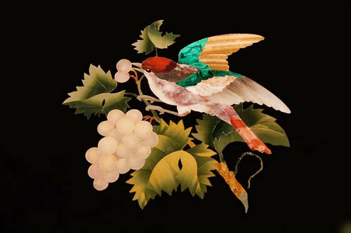 |
| eBay |
 |
| Mark D. Ruffner |
I'm making a record of some of the Pompeian borders. Note that they're
very flat at close range, but quite 3-dimensional at a distance.
 |
| Mark D. Ruffner |
Another good border, and I like those panels at the bottom of the image —
expect to see those incorporated into my own room. Now look to the
center of the image, at the white decorations that are acting as
supports.
 |
| Mark D. Ruffner |
Those are a decoration the Pompeians borrowed from Greek design.
Occasionally, the bottom "limbs" are fish tails, but more often they are
represented as Acanthus leaves.
 |
| Mark D. Ruffner |
The Pompeian artists created fluted columns with believable shading by
simply painting solid vertical lines in analogous color combinations.
 |
| Mark D. Ruffner |
Moving to the Greek and Roman galleries, I came upon this fragment and fell in love with the tremendous attitude expressed here.
 |
| Mark D. Ruffner |
I view museums, galleries and sometimes even retail stores as catalogs
for ideas and reference. I'm often gleaning details that I can put to
later use. Here, though the torso was lovely, I documented the
expressive hand and the folds of drapery.
 |
| Mark D. Ruffner |
I made a mental note that eagles can rest atop garlands, and garlands
can hang from the horns of rams. Look at the eye of the ram on the
right. Sheep and goats have such strange eyes, and the sculptor captured
the expression perfectly, don't you think?
 |
| Mark D. Ruffner |
Here's a satyr from the underside of a huge urn. Have you ever known anyone that mischievous? I have.
 |
| Mark D. Ruffner |
In another part of the museum I recorded paintings with metal
reflections. I could have used this when I was painting the clipeus!
 |
| Mark D. Ruffner |
It's worth a trip to the armory gallery just to see the helmets! This
beauty dates from the 1500s. Surely it was only used for triumphal
processions — I'd hate to see that get dented!
 |
| Mark D. Ruffner |
This is a composite photograph of three halberds. I thought it was interesting that all three had tassels and hobnail patterns.
 |
| Mark D. Ruffner |
My reference collection isn't restricted to the Metropolitan; walking
the streets of New York, I photographed this handsome architectural
detail. I can use that for the base of my own mural columns.
 |
| Mark D. Ruffner |
Likewise, this carved border is wonderful reference.

Next week, I'll start incorporating some of my finds
into the Pompeii Room.
Chapter 16: The History of the Trophy
 |
| The Universal Penman | Dover |
This week, I'm back from the Metropolitan Museum of Art, and ready to start painting trophies.
Today when we think of "trophy," we probably think of sports cups or
mounted safari heads, but of course the trophy goes far back into the
mists of time.
Trophy actually comes from the Greek word
tropaion, which means a rout, or turn of the battle.
 |
| The Complete Encyclopedia of Illustration | J. G. Heck |
When the Ancient Greeks won a battle, it was their custom to adorn tree
trunks with the weapons of the fleeing enemy, as shown above. The Romans
did likewise, and these arrangements served as memorials of victory. My
own theory of this practice is that designated trees may also have been
collection points for the booty that would eventually be carried as
part of triumphal processions (but I could be wrong about that).
 |
| Antiques in Italian Interiors | Roberto Valeriani, Mario Ciampi | Verbavolant |
It became the custom in European and especially Italian palaces to show a
grouping of battlefield remnants to allude to a family's victorious
heritage. In some cases the depiction celebrated a specific event, and
in some cases it was pure decoration.
 |
| Antiques in Italian Interiors | Roberto Valeriani, Mario Ciampi | Verbavolant |
Here's a wall filled to the ceiling with booty . . .
 |
| Antiques in Italian Interiors | Roberto Valeriani, Mario Ciampi | Verbavolant |
. . . and here's a wall with the booty depicted in three dimensions.
 |
| Handbook of Ornament | Franz Sales Meyer |
When speaking of architectural ornament,
trophy more often refers to a column of military relics, usually strung together on a pike, pole or ribbon, as above.
 |
| Antiques in Italian Interiors | Roberto Valeriani, Mario Ciampi | Verbavolant |
Here's a fine example of the trophy painted to look like bas relief on a vaulted ceiling.
As I looked at the narrow spaces on either side of the Pompeii Room's
window, I thought that they would be perfect for trophies. Don't forget,
the owner of this room is not a native Pompeian, but rather an
important Roman who just happens to have retired there. Who knows,
perhaps he's even a little homesick for Rome.
 |
| click to enlarge |
Here's the layout for the trophies, each painted in their flat, base
colors. In the next two weeks we'll look at the left trophy and the
right trophy respectively, and have fun with the details. I hope you'll
join me then!
Chapter 17: The Left Trophy
This week and next, we'll be looking at the mural's narrow "Trophy
Walls." Both of my trophies will be on stands, as though all the
paraphernalia is ready to be donned at a moment's notice.
 |
| Mark D. Ruffner | Metropolitan Museum of Art |
I've chosen to use this helmet from the Metropolitan Museum of Art. It
dates from 1788-90, and was part of a costume used in the French
theater. Though it is of a later period, I'm of course using the helmet
because of its spectacular Neoclassic design.
The armor is a composite of historic examples that I've found in
reference books, and on the Internet. Yes, there really was armor with
such a scallop shell design.
Moving down, the shield is modeled after an actual design used by one of
the Roman legions, below, though it would have been a bright red. Note
the Macedonian stars, about which I spoke
here.
 |
| buzzle.com | twcenter.net |
The round shield was called a
parma, and it would have offered less protection than the body-length shield on the right, which was called a
scutum. The soldier holding the scutum would have been in a tight formation in front of the soldier holding the parma.
 |
| U. S. Military Shoulder Patches of the United States Armed Forces, 5th Edition |
Above are several insignia of the United States Army, and one can see
here the influence of Roman design into our contemporary time. From left
to right: the 17th Field Artillery Brigade, the 18th Field Artillery
Brigade, the 30th Field Artillery Regiment, and the 197th Field
Artillery Brigade.
The base of the stand continues the Imperial Roman theme with a golden eagle, in turn supported by lion claws.
Below is the finished Left Trophy Wall.
 |
| click to enlarge |
Next week we'll look at the right wall, which has the same format, but completely different details.
Chapter 18: The Right Trophy
Last week, I unveiled the finished left trophy, but I've actually been working on both trophies simultaneously.
Like the left trophy, the right trophy features a helmet that is on display at the Metropolitan Museum of Art.
 |
| Metropolitan Museum of Art |
The helmet is called a
burgonet, a term that is derived from the word
Burgundy.
This one is embossed steel and dates to between 1545 and 1550, and it
was probably made in Milan, Italy. The Metropolitan rues the fact that
early conservators polished a subtly engraved background pattern
completely away!
I've mentioned that I like to use as much reference as possible, and
when I was designing the trophies, I had a clear vision of heavily
grained poles upon which to mount the paraphernalia. Where would such
wood exist? I ended up photographing weathered telephone poles that face
the Gulf of Mexico, near my neighborhood.
Moving down and behind the shield are a number of implements that are
historically correct. (I have taken a little license with the baton in
the form of a battering ram, if only because I wanted the pleasure of
painting the ram's head!) The hand is the top of a Roman standard.
Unlike the shield of the left trophy, the design of this shield was
never seen in Rome. Instead, I have borrowed the design of a cameo from
the collection of Catherine the Great, below.
 |
| photo-illustration, Mark D. Ruffner | ancientrome.ru |
Looking at the collections of Catherine the Great, one quickly realizes
what a discerning eye she had. She loved cameos, and especially jeweled
ones, but it was her habit — one can clearly see by looking at her
collection — to replace any jeweled frames with very simple ones. She
evidently didn't want anything to detract from the artistry of the cameo
itself.
The base of the right trophy complements, but is not identical to the left trophy.
Below is the finished Right Trophy Wall.
 |
| click to enlarge |
That panel on the right is looking quite bare now, don't you think? In
the next week we'll figure out what to put there. I hope you'll join me
then!
Chapter 19: Finding the Muse
In my last three postings, we looked at the trophy as an ornament, as
well as my interpretations of the trophy, which now decorate both sides
of the dining room window.
Now it's time to decorate the three panels that are x'd above. My
thought all along was that these areas should have figures, as so many
Pompeian murals did.
 |
| Italian Frescoes: The Flowering of the Renaissance | Roettgen |
Originally, I was planning on three figures posed heroically, like this
image by Domenico Ghirlandaio. If I used centurions, it would be a nice
continuation of the trophy theme.
 |
| www.bythegods.net | Antiques in Italian Interiors, Verbavolant |
I also considered using statues of Roman gods, like this one of Jupiter
with his lightning bolts, and maybe putting them in alcoves like the
image on the right. There were certainly a lot of Roman gods from which
to choose!
 |
| Pompeii, Riverside |
Another thought was to paint what I would call vignettes, figures on
plain backgrounds. The painting on the right you might call a celebrity
portrait; it's of the Greek playwright Menander, who authored more than a
hundred comedies.
 |
| Karl Friedrich Schinkel: An Architecture for Prussia | Rizzoli |
In Pompeian decoration — and its numerous revivals — such figures often
float in the center of a panel, but in the back of my mind . . .
. . . I really liked the look of the grounded figures shown above. This
is a screen-save from a video on British royal palaces. Fiona Bruce is
walking through the Venitian lodging of the 18th-century British consul,
Joseph Smith. (If you are like I am, you're always admiring the
wallpaper at the very moment in a movie when someone gets killed!) I
like those pedestals, and if I had figures at the bottom of the panels,
there would still be room for ornamentation between the figures and the
garlands.
 |
| click to enlarge | academicnudes19thcentury.blogspot.com |
In my wanderings through the Internet, I came upon these engravings by a
19th-century German illustrator named Hugo Bürkner (1818-1897). What
struck me about these images is that Bürkner obviously studied
Michelangelo. You can see that especially in the central engraving, in
the musculature and draping of cloth. I would make some changes, but I
think these muses of painting, sculpture and architecture would make
dandy Pompeian motifs.
 |
| 100swallows.files.wordpress.com | photo by Wkinght94 |
And it would also be a nice nod to Michelangelo, whose tomb
coincidentally bears the three muses of painting, sculpture and
architecture. Michelangelo's tomb, by the way, was designed by Vasari,
remembered today primarily for his biographies of other artists.
So it's settled.
Next week I'll unveil the first panel figure,
the Muse of Painting!
Chapter 20: The Muse of Painting
 |
| academicnudes19thcentury.blogspot.com |
As I studied this engraving by the 19th-century illustrator, Hugo
Bürkner, it occurred to me that he had in turn studied Michelangelo, and
that my color interpretation of Bürkner's engraving would benefit from
my revisiting Michelangelo and his work.
 |
| The Sistine Chapel: A Glorious Restoration |
The great irony of this resplendent painting by Michelangelo, the tondo of the
Holy Family,
is that its creator didn't consider himself a painter and vigorously
resisted most painting assignments. Even more amazing is that the man
who commissioned this as a wedding gift for his wife was dissatisfied
with the result.
 |
| The Sistine Chapel: A Glorious Restoration |
In all of Renaissance painting, one will be hard pressed to find a more sensitively rendered infant Jesus.
I've chosen the tondo primarily as a color reference, and in particular, I'm looking at Michelangelo's sumptuous fabrics.
I begin with lots of color reference at hand, and by working upon a
light, neutral silhouette. To work directly on those dark background
colors would be difficult for me (though I have known artists who do
like to work from dark to light).
I've made a number of changes to Bürkner's original design to suit my own purposes:
- The image is reversed so that the shadows fall in the same direction as the mural's adjacent columns.
- I'm guessing that the two small figures, which are male and female,
represent the yin and yang of creativity. But as all the muses will be
feminine, I have decided to make all their attendants masculine. We'll
just have to come up with a different allegory for these two.
- I've added height to the pedestal, and that has everything to do
with adjusting the figures so that they bisect the two background colors
in a pleasing manner.
- I've also lengthened the muse's paint brushes, just to add a little more generous dimension.
- The muses's face is more mature, and I've indicated that she actually does have a jaw!
- I wasn't sure what instrument the boy was resting his hand on, but
I've painted it to look more like a prism. Then I added reflected light
to the bottom of his leg.
- One of the biggest changes is getting rid of all that fussy
Victorian underbrush. For a sparer, more classic foliage, I turned to
Mr. Wedgwood, below.
 |
| source |
Below is the final Muse of Painting.
 |
| click to enlarge |
No matter how much color correction I do, the purple of the base
translates more vividly on the Internet. It is in actuality less
intense.
 |
| click to enlarge |
Next week we'll go to the opposite wall
and look at the Muse of Sculpture.
I hope you'll join me then!


 This week I'm focusing on the structure that connects my columns, creating an entablature for the Pompeii Room.


 As I looked at the narrow spaces on either side of the Pompeii Room's
window, I thought that they would be perfect for trophies. Don't forget,
the owner of this room is not a native Pompeian, but rather an
important Roman who just happens to have retired there. Who knows,
perhaps he's even a little homesick for Rome.
As I looked at the narrow spaces on either side of the Pompeii Room's
window, I thought that they would be perfect for trophies. Don't forget,
the owner of this room is not a native Pompeian, but rather an
important Roman who just happens to have retired there. Who knows,
perhaps he's even a little homesick for Rome. This week and next, we'll be looking at the mural's narrow "Trophy
Walls." Both of my trophies will be on stands, as though all the
paraphernalia is ready to be donned at a moment's notice.
This week and next, we'll be looking at the mural's narrow "Trophy
Walls." Both of my trophies will be on stands, as though all the
paraphernalia is ready to be donned at a moment's notice. The armor is a composite of historic examples that I've found in
reference books, and on the Internet. Yes, there really was armor with
such a scallop shell design.
The armor is a composite of historic examples that I've found in
reference books, and on the Internet. Yes, there really was armor with
such a scallop shell design.
 Moving down, the shield is modeled after an actual design used by one of
the Roman legions, below, though it would have been a bright red. Note
the Macedonian stars, about which I spoke here.
Moving down, the shield is modeled after an actual design used by one of
the Roman legions, below, though it would have been a bright red. Note
the Macedonian stars, about which I spoke here.

 Last week, I unveiled the finished left trophy, but I've actually been working on both trophies simultaneously.
 Like the left trophy, the right trophy features a helmet that is on display at the Metropolitan Museum of Art.
 I've mentioned that I like to use as much reference as possible, and
when I was designing the trophies, I had a clear vision of heavily
grained poles upon which to mount the paraphernalia. Where would such
wood exist? I ended up photographing weathered telephone poles that face
the Gulf of Mexico, near my neighborhood.
I've mentioned that I like to use as much reference as possible, and
when I was designing the trophies, I had a clear vision of heavily
grained poles upon which to mount the paraphernalia. Where would such
wood exist? I ended up photographing weathered telephone poles that face
the Gulf of Mexico, near my neighborhood. Moving down and behind the shield are a number of implements that are
historically correct. (I have taken a little license with the baton in
the form of a battering ram, if only because I wanted the pleasure of
painting the ram's head!) The hand is the top of a Roman standard.
Moving down and behind the shield are a number of implements that are
historically correct. (I have taken a little license with the baton in
the form of a battering ram, if only because I wanted the pleasure of
painting the ram's head!) The hand is the top of a Roman standard. The base of the right trophy complements, but is not identical to the left trophy.


This is an understatement as a comment but the first thing that springs to mind, is that this is all such fun! Most people, who live in houses with flat walls never realise the potential of the blank canvass they see before them. Now living in an old vernacular farmhouse with very uninspiring rough stone walls, I fully appreciate what has been lost. I now regret the 1930's semi and the 1970's rabbit hutch. I just gave the former a touch of cinema and the latter a hint of fairytale. All the very best and shall now continue reading, Sue
ReplyDeleteHello, Sue,
ReplyDeleteYes, I've had a lot of fun, as much in the research and planning as in the execution. There is no doubt that the most effective way to bring new life to a house — and inexpensively — is to add a coat of paint. To the people who are shy of color, and that's most people, I would encourage simply looking through magazines and books of current or historic rooms that are successful. I'm equally inspired by interiors of other cultures, and I'm happy to borrow from anywhere and everywhere.
Having said all that, the stone walls of an old farmhouse sound very appealing to me.
Thanks for visiting.