Monday, June 27, 2011

A Trip to Sarasota Architectural Salvage


This past Saturday, Sandy, Kate and I made a trip to Sarasota Architectural Salvage, about 40 minutes from St. Petersburg. The company has a lot to see inside as well as outside, and what a treat! There was much metalwork to choose from, and I was thinking that this would be the place to come for an exotic trellis.


This classic scrollwork could be from an original Greek Revival house.


Lots of great doors ...


... and columns, too.


Hey, did someone dismantle a blue temple?


Inside, everywhere one turns reveals something beautiful or strange, or both!


Bins of storefront letters ...


I'm greatly attracted to etched stained glass.


I saw lots of pressed glass,
and Turkish mirrored tiles, too.


Carved panels from Asia ...


... antique grates and brackets ...


... and even some tile that would make my blogging friend Gina,
of Art and Alfalfa, smile!


1093 Central Avenue  |  Sarasota  |  Florida  |  34236
.

Thursday, June 23, 2011

Fun Crosshatching


When I was an aspiring artist, barely in high school, I started making files of images that caught my attention, mostly for their style. My own talents were unformed, so I looked to others for inspiration.


One of my first clippings, in 1963, was this British depiction of a miserly Uncle Sam. (When this Punch cartoon was drawn, the U.S. and Britain were settling claims that had arisen during the Civil War.) As a kid, I was intrigued by crosshatching, and how depth and volume could be achieved with it. When I clipped this, my own attempts at crosshatching were disappointing!


An illustrator whose drawings excited me was Alan E. Cober, who worked through Push Pin Studio. His illustrations ran in magazines like McCall's at a time when the other illustrations were quite staid by comparison.


Cober created rich textures by overlapping images, crosshatching in color, and making shadows with areas of parallel lines that are known simply as "hatching." All these Cober illustrations are details of larger illustrations, now starting to discolor and fray.


The illustrator Einsel created wonderful textures with a jagged line, and in the hair above, the illusion of crosshatching — lines that don't actually cross but look like neat crosshatching.


Another popular artist of the early 1960s was the caricaturist David Levine, shown in this self-portrait. His rich satire follows the tradition of great cartoonists like the American Thomas Nast and the English Sir John Tenniel.


Here's a delightful crosshatched illustration — I wish I knew the artist. Every time I see crosshatching that looks like a series of exclamation points on their side ...


... I know the artist has been studying bank note engravings, like the one below.

The Art of the Market   |   Tamararkin and Krantz   |   1999

Possibly the greatest American bank note engraver, and by default the greatest crosshatcher, was Asher B. Durand, whom I discussed in an earlier posting, here.


In my files I even started keeping textures that approximated crosshatching. Look, there's Mr Einsel's jagged line!

Mark D. Ruffner  © 2011
Here's one of my own illustrations, an Elizabethan unicorn. The original of this illustration was done on a sheet of 8½ x 11 bond paper, not much bigger than how you're probably viewing it right now.
.

Tuesday, June 21, 2011

The Itinerant Adman


Several years ago, the residents of St. Petersburg, Florida started experiencing an interesting phenomenon. As they rushed around on errands, they'd come across an inspirational saying or a lovely poem, beautifully lettered in chalk on the sidewalk. Sometimes the chalk markings would be a poem of a dozen lines, and sometimes there would only be a heart shape.


These random markings were arresting to the eye, and welcomed alike by shopkeepers and pedestrians. Eventually the artist made a segue into advertising slogans — simple, always well lettered, and always in chalk. I've come to think of him as the "Itinerant Adman."


Eventually, like the classified section of an old newspaper, the ads fade and disappear. New ads appear, and occasionally a poem, a word of inspiration, or just a symbol that makes one smile.


.

Friday, June 17, 2011

From Tobacco Cards to Baseball Cards


If you've had an opportunity to visit my page on trade cards and the evolution of corporate identity (in the right-hand sidebar), you know that Victorians of all ages enjoyed receiving little premium cards with virtually everything they purchased.


The cards of tobacco companies were especially popular because they were often distributed in sets. Above is one of my cards from the 1870s, of Edwin Booth, brother of John Wilkes Booth, and one of the greatest actors of the 19th century. It was distributed by Between the Acts Cigarettes, and would have been included in a set of famous actors.
From my collections, here are two views of a Between the Acts tin from the 1920s. It still has its tissue and all the cigarettes!

Metropolitan Museum of Art

The ancestor of the bubblegum card was the tobacco card. Customers going into a tobacco shop might have seen a poster like the one above. It displays a complete set of racing colors, each card of which was in an individual pack. Of course one would have had to smoke a lot of cigarettes to get a complete set.

Click to enlarge

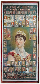
I was fortunate enough to find a cigarette poster by the same tobacco company. It features all the rulers of the world, and dates to the 1880s. In the poster, all of the cards are actual size.


These handsome cards from the Jefferson R. Burdick collection, at the Metropolitan Museum of Art, were distributed by the American Tobacco Company in 1911. As tobacco card sets progressed, there became a greater emphasis on sports and athletic teams.


The rarest baseball card is this 1909 Piedmont Honus Wagner, which recently sold for $1.62 million. The card was in early distribution when Honus Wagner objected to being associated with the sale of tobacco, and demanded that all remaining cards be withdrawn.

Perhaps Honus Wagner, who was very popular, was a factor in the transition from tobacco cards to bubblegum cards. More likely it had to do with the gradual death of trade cards in general. In any event, the collecting of baseball cards shifted to a younger demographic, and the cards came to be issued by candy companies.


These striking cards, also from the Metropolitan Museum of Art, were distributed with Cracker Jack candy between 1914 and 1915.
.