Other Interesting Pages

Monday, January 31, 2011

Recreating a Trajan Inscription


One of the great monuments in Rome is the Trajan Column, built to commemorate Trajan's victory in the Dacien Wars. Its spiraling bas relief frieze depicts two wars that each lasted but one year. For lovers of typography, the Tajan Column also includes what is considered by many to be the finest example of Roman lettering in existence. Below is a portion of the inscription, executed by an anonymous master.


In 1989, Carol Twombly of Adobe Systems designed a very literal interpretation of the inscription, a typeface that was of course named Trajan. I've reconstructed the image below to illustrate how faithful Twombly's font design is to the original.


Below is an image of Carol Twombly from her days at Adobe Systems, and some of her typeface designs.


Friday, January 28, 2011

Pack Rat, The Grand Acquisitor

Illustration by Charles B. Slackman, for Horizon Magazine, Winter 1969
When I read The Grand Acquisitor, Horizon Magazine's 1969 article on the pack rat, I was absolutely charmed. I hadn't realized that there actually is a small rodent that hunts for objects that are attractive though totally useless to him (Sound like some other species?).

Rodentia   |  Cricetidae  |  Neotoma
The pack rat has sleek fur, a white stomach and a bushy tail, and bears a close resemblance to the hamster. In his nervous movements, he's sometimes compared to the squirrel, and he's a very busy thief. Food is a big portion of his loot, of course, but the pack rat is attracted to almost anything in his path. Unlike the magpie, who is discriminating, the pack rat is indecisive when confronted with a choice of objects. Because he's famous for lugging along one item, seeing another, and then leaving his first choice in place of the newer find, the pack rat is sometimes called a trade rat.

The pack rat takes his treasures back to an ever-growing nest which is inhabited by a succession of rats, often generations of the same family. With all the clutter of oddities, the nest is appropriately referred to as a midden.

I found the personality of the pack rat so amusing that I decided to paint this curious little animal.

© Mark D. Ruffner
This is a color sketch for a pack rat painting. I did several which I gave away, but in each one, the pack rat was a collector of antiques, quilts, posters and famous paintings.

© Mark D. Ruffner
My mother enjoyed the series so much, she requested her own pack rat painting. So this is The Swiss Pack Rat. All the items allude to Switzerland or family. The flirtatious lady in the background is my grandmother, who was from Bern. The pack rat wears a traditional Bernese hat, which mirrors my grandmother's. He proudly displays the Basel Dove, Switzerland's rarest stamp (my mother was a philatelist), but unfortunately the stamp is being sliced by a Swiss Army Knife!

I'm thinking of painting another pack rat, but this one with older items closer to his scale. I've settled on an Indian Head penny and an old bottle cap, but haven't thought beyond those two items. I'd love to get your suggestions! What would you include in a pack rat's midden?

Monday, January 24, 2011

Trade Cards and Their Evolution

For a long time, one of my great passions has been collecting the ephemera known as trade cards. These bright advertisements were a scrapbooking rage throughout the latter part of the 19th century. The Americans of that era were excited about the full-color printing that was very new, and by the imaginative work of artists who apparently had free design reign.

I've chosen some cards from my collection that illustrate how images like the one above evolved into advertising that was closer to what we would today call corporate identity or branding. To access them, just go to the right-hand column and click on that iconic, 19th-century pointing hand.

Sunday, January 23, 2011

The Stylish Blogger Award


I am delighted to announce that I have been honored with the Stylish Blogger Award by pgt of little augury. Blogging provides a forum that can be a satisfying opportunity for creative expression, which is exactly the way I approach every posting. It’s equally pleasurable to learn from so many talented fellow contributors, and to exchange and share images and ideas. Thanks, Gaye!


The Stylish Blogger Award is to be accepted under condition of the following rules:

1) Thank and link back to the person who awarded you. (Done)

2) Share 7 things about yourself. OK, here goes:

• My ancestry is Swiss, on both sides of my family.
• Andy Warhol and I shared the same design professor, 20 years apart.
• One of my great pleasures has been to gradually transform the front of my house from a nondescript style into a Neoclassic facade.
• At the age of eight, I copied all the U.S. presidents' faces as a drawing exercise. As a result, I've never quit reading presidential history.
• I think it's valuable for artists to collaborate with artists in fields other than their own. The experience invariably brings new perspectives to one's own artwork.
• I've taken the Evelyn Wood Speed Reading course but still read slowly because I enjoy lingering over well-written passages, and dwelling on the imagery.
• I like to start my day by doing two crossword puzzles.

3) Award 10 other bloggers.

4) Contact those bloggers and tell them about the award. This is not only a form of recognition from your peers, but also a wonderful avenue for introducing new readers to great blogs. It's what Gaye calls, "spreading the love around."

I am happy to pass this award on to these Stylish Bloggers:


Saturday, January 22, 2011

Dover Books, and Using Clip Art


As I've mentioned, I started out my career as a commercial artist, long before personal computers and the current multitude of clip art services. Non-artists often assume that artists conceive off the top of their head, when in fact most professional artists (designers, sculptors, architects, et al) are both careful observers and good researchers. As I was doing commercial jobs, I relied on my own photography as reference, and family and friends often modeled.

I also used a large collection of Dover books. Dover Publications has been in business since 1941, and for decades it's been of great use to designers. That's because it publishes, in paperback form, 17th, 18th, 19th and 20th century art that is now in the public domain and copyright-free. One can incorporate antique elements into designs with great effect, and now Dover is further providing their wares in digital form.

I have to add though, that as a commercial artist I seldom used clip art in its raw form (as is commonly done today). For me, Dover books - and any other art references - were a starting point, a point of departure. Here's a great example:

I was commissioned to design a logo for a local non-profit foundation that does good deeds, really a bunch of angels. I found this delightful engraving in a Dover book, and I thought it fit the bill. The engraving is French and dates to the 1600s. I'm not enamored of the drawing itself - the anatomy is not quite right - but I love the idea. I find it delightful that cherubs and angels might sow and reap, even as we do. The foundation liked the image and association, too.

Here is my final design. I refined this many times in pen and ink on paper, and then redrew my final design (which at that point included pieces of paper pasted together) by computer.


Wednesday, January 19, 2011

A Fun Resolution to a Bathroom Dilemma


My friends Sandy and Greg recently bought a rental house in need of much cleaning and restoration. Fortunately for them, the house was very solid and many of the problems were cosmetic. Also, the last and original owner had never made "improvements," which in my experience are often harder to undo than anything original to a house.

Notice the terrazzo floor, a great plus in older Florida houses.

The bathroom posed an interesting problem. The original 1948, built-in sink was in bad shape and needed to be replaced. It had been a little deeper than the design of current sinks, which meant that when the new sink was installed, at least a dozen tiles would need to be replaced. Have you ever tried to match 63-year-old tiles? It's virtually impossible, and the budget wouldn't allow for all new tiling.

My suggestion was to fill the space with a plasterboard that was painted the exact color of the tiles. Today, through the wonder of scanners and computers, paint stores can match virtually anything you hand them, so that wasn't a problem. They matched the small tile at the beginning of this post.


And here's a view of the finished project. It's not seamless, but it's a fun solution — and a bathroom conversation piece to boot!


Sunday, January 16, 2011

Inside the New Dali Museum


In my last posting, I showed this view of St. Petersburg's new Dali Museum. Now we'll go inside for an Opening Day tour!

One enters and leaves the Dali Museum through a colorful store that's a repository of all things surreal. Every imaginable book pertaining to surrealism is represented, as well as books on subject matter that interested Dali, such as the Golden Mean.

Next to the gift shop is this classic Rolls-Royce, covered in seaweed and snails. The driver wears antique diving gear and the passenger is a mermaid.

The windows are designed to appear as though it's always raining inside the car, and lighting and sound effects evoke a thunderstorm.

The ground floor has a café with a sitting area, as well as a counter with these cool stools.

After the geodesic glass, the focus of the museum's interior is a spiraling staircase, modeled after the DNA double helix. It was a shape that intrigued Salvador Dali.

The view is of the St. Petersburg bayfront, and Tampa Bay.


I thought this tangent structure was interesting.

Some of Salvador Dali's most famous works are actually surprisingly small. Beginning in 1948, though, Dali worked on a monumental scale, and these later pieces are referred to as "masterworks." I would have loved to have shown you peeks into the galleries, but museum rules forbid photographing those areas. Suffice to say, masterworks abound in the most comprehensive collection of Dali, and the largest collection of his work beyond Spain.


 1 Dali Blvd., on the St. Petersburg bayfront,
at the southern end of Bayshore Drive SE

Hours: 10-5:30 p.m., Monday, Tuesday, Wednesday, Friday and Saturday
10 a.m.-8 p.m., Thursday  •  Noon-5:30 p.m., Sunday


Thursday, January 13, 2011

The New Dali Museum Opens

This past Tuesday, at 11:11 a.m. (numerology that would have pleased Salvador Dali), I joined about a thousand other guests and spectators to celebrate the opening of St. Petersburg's new Dali Museum.

Lots of people got in the spirit of the day and came in Dali costumes, like Janice Embrey Brown (l.) and B. J. Ebersold (r.), both Dali Museum docents.

There was also a large and colorful contingent from the Krewe of the Knights of Sant' Yago.

I don't think anyone would argue that the most ardent Dali supporter that morning was a young man named Daniel.

The ceremonies began with a parade from the old museum to the new building, led by the Snailhead Stilt Walker.

Here I am with the architect, Yann Weymouth. Note that he's wearing a tie that repeats the geodesic glass structure.


Mr. Weymouth designed the $36 million building to withstand a Category 5 hurricane. Galleries are located in 16,000 square feet of space on the third floor, so there will never be a worry about flooding. In my posting on Sunday, I'll be sharing views from inside the museum and through those windows. But for now, I thought I'd show a couple of neat outdoor details.


The entrance to the museum is described as a grotto, and it appears to support one corner of the structure. Incorporated into the grotto is a Fountain of Youth. I drank from it, but haven't noticed any changes kick in yet.


Here's a sliding metal gate that casts Dali's signature in light. Wouldn't he have loved that!

The new Dali Museum was dedicated by the Infanta Cristina, daughter of Spanish King Juan Carlos I. Numerous dignitaries spoke, but the most interesting comments were by Brad Morse, son of benefactors A. Reynolds and Eleanor Morse, and by Jorge Dezcallar, the Spanish Ambassador to the United States.

Brad Morse described his parents' passion for the works of Salvador Dali, and how Dali art overflowed even onto the walls of his childhood bedroom. He also described how the elder Morses never turned down requests by complete strangers to come to their Cleveland home to look at their collection.

Ambassador Dezcallar described that as a young diplomat in the United States, he had wanted to meet Salvador Dali. He telephoned the artist, who suggested that the young Dezcallar treat him to lunch. The ambassador described Dali then coming to the restaurant with a party of eight! With not enough money to cover the bill, and credit cards not allowed, Dezcallar had to leave his watch behind.

Sunday - views from inside the new Dali.

Monday, January 10, 2011

That Clever Thomas Chippendale!

When I was building two walls of bookcases in my living room, I decided to include decorative brackets that were a Thomas Chippendale design. I modified the proportions to suit my own purposes, but stayed pretty faithful to the Chippendale look.


Recently, (and 20 years after my bookcase design) I was going through some old family papers, and I found a photostat of an architectural drawing my father had done in the 1930s. 


As I studied my dad's drawing, I saw a familiar shape in a detail. Then I realized that to achieve a furniture bracket, Thomas Chippendale had undoubtedly borrowed the silhouette of a column base and simply inverted it. That clever Thomas Chippendale!


Friday, January 7, 2011

Neoclassic Wallpaper

Photo by Fritz Von der Schulenburg | Neoclassicism in the North | Groth | Rizzoli, 1990
This is not wallpaper. Far from it. You're looking at the 1823 bedroom of King Carl XIV Johan of Sweden. The room was meant to resemble a battlefield tent, and it was the popular bedroom fashion for the crowned heads of the Napoleonic era. A prime example is Empress Josephine's bedroom at Malmaison, below.

The French Empire Style  |  Alvar Gonzalez-Palacios  |  Hamlyn, 1970
For those unable to buy tons of satin and velvet, there was always wallpaper — and very regal wallpaper, too.

L'Art de Vivre  |  The Vendome Press, 1989
Architectural Digest, October, 1995
L'Art de Vivre  |  The Vendome Press, 1989
The three previous images are the designs of Xavier Mader, who worked in France for the Dufour company, from 1808 to 1823. These wallpapers are an interesting social statement; while the nobility lost political relevance in France, and as the middle class grew, the preferred aesthetics remained that of the nobility.

L'Art de Vivre  |  The Vendome Press, 1989
This anonymous, delicate French wallpaper design includes the framed prints below the fabric and the surface behind them — wallpaper of fabric upon fabric.

Photo, Robert Lautman | Greek Revival America  | Kennedy | Stewart Tabori & Chang, 1989
The Neoclassic fashion of curtained wallpaper extended to the United States. This is the dining room of the Campbell-Whittlesey House, in Rochester, New York. It dates to 1836.

Photo by Mick Hales  |  In the Neoclassic Style  |  Fleischmann  |  Thames and Hudson, 1988
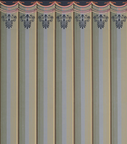
Because it's so classic, wallpaper of draped fabric has a very stylish, contemporary look.


Adelphi Paper Hangings is a company that hand blocks historic wallpapers, including colonial and Empire designs. The story of their custom designs is most interesting, and you can access them here.
.......................................................

You'll notice a new feature on my sidebar — "Antique Button of the Month." Every month I'll be sharing a new button from my own collection. I hope you enjoy them — I think you'll find that Victorian buttons were amazingly detailed and jewel-like.