
My blogging friend Yvette of In So Many Words recently posted on 10 male portraits she'd like to own, and now it's my turn. Actually, the following aren't necessarily all-time favorites, but I like to study each of them for one reason or another. I'll share them with you in the order they were created:
 |
| Holbein | Phaidon |
This is a detail of Hans Holbein's famous painting, The Ambassadors, painted in 1533. Here is the French ambassador to the court of King Henry VIII, Jean de Dinteville. Holbein was famous for painting very truthful portraits, so much so that he was sent to paint the king's prospective brides (Henry was nonetheless surprised upon meeting Anne of Cleves!).
There is a tremendous sensuousness to Holbein's portraits, and I believe that's due in part to the exquisite and sensitive modeling of lips and eyes. Look at a hundred portraits throughout the history of painting, and you'll be hard-pressed to find eyelids — yes, eyelids — painted with such definition.

 |
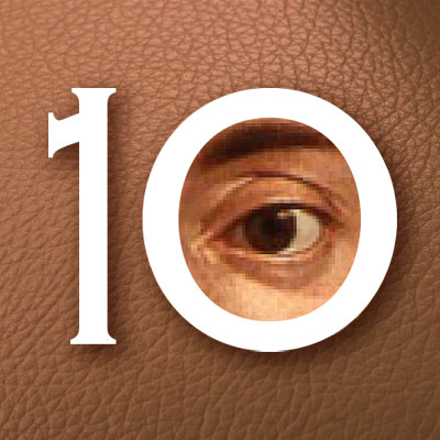
| wikimedia.org |
By contrast, Rembrandt Peale obscured his brother Rubens' eyes in this 1801 portrait, and that only adds in conveying the brother's personality. The reflections from the glasses are a wonderful touch, and the depiction of the geranium is worthy of the best botanical painting. Rembrandt Peale painted this when he was 23 years old.
 |
| Metropolitan Museum of Art |
Jean-Léon Gérôme painted Bashi-Bazouk in Paris, in 1869. In his own time, Gérôme was well known for his exotic paintings of the Near East, and he returned from an expedition there with many costumes and props. I've found another painting with the same headdress at artsunlight.com. (Both sitters are models.)
 |
| artsunlight.com |
While the painting on the right is a handsome piece, it's interesting to see how much stronger and more effective the painting on the left is — it's a far better painting in terms of composition, color, lighting, even the pose and attitude of the sitter.
 |
| fineartamerica.com |
One of the best White House portraits is this 1919 sketch of President Woodrow Wilson by the British artist Sir William Orpen. This was done at the same time that Orpen documented the signing of the Treaty of Versailles, probably his most famous painting. I've seen Orpen's work in person, and looking at reproductions doesn't do justice to his rich brushwork.
Speaking of White House portraits, I've been disappointed with the more recent ones, which are formulaic, predictable and dull. Their backgrounds are usually unimaginative White House backdrops.
 |
| americangallery.wordpress.com |
And that's why I like this portrait, not of a president, but of an Iowa pioneer named John B. Turner. Grant Wood painted this in 1929. He took an elderly gentleman whose fame probably never extended far beyond Rotary Club meetings, and placed a distinctive antique map of Iowa behind him. Suddenly there's an extra depth to the sitter's countenance, and we wonder, just what did Mr. Turner do? This portrait was one of the first paintings to gain attention for Grant Wood.
 |
| pdfcast.net |
I mentioned Pietro Annigoni in my presentation of 10 noteworthy paintings of women. He painted this image of Conti Giancarlo Bossi Pucci c. 1950. I love this painting's golden glow, and again, the unique background. It's an interesting composition — note how the opening in the ceiling complements, mirrors and accentuates the forehead.
 |
| artoftheprint.com |
I'm not limiting this selection to paintings. I've always admired the very distinctive wood engravings of Leonard Baskin (1922-2000). He cut this portrait of Gustave Courbet in 1969. It was one of a series of portraits he did of 19th-century painters.
 |
| aotw.com |
This young Sioux was painted by James Bama in 1988 or before. Bama started as a commercial artist and then had a second career solely devoted to Native Americans and cowboys of the American West.
 |
| tfaoi.com |
 |
| galeriemax.com |
My final choice is this self-portrait by Chuck Close, done in 2012. I love the fact that Close establishes such a tight grid, and then breaks out of it. I also appreciate how Close's unique style has evolved in a very natural progression:


