Monday, March 28, 2011

Maxfield Parrish Reworks a Painting

The Millpond  |  photo by Robin L. Perry

Maxfield Parrish (1870-1966) was an American illustrator known for his paintings of vibrant, lustrous colors, usually incorporating a beautiful blue that was named after him — Parrish blue. He worked by glazing, which means that he built up layers of oil color separated by layers of varnish. If you ever see a Maxfield Parrish painting in person, you'll be struck by its luminosity and truly jeweled tones.

International Paper Pocket Pal

If you have any involvement with printing, you also know that images are separated into four plates of color — yellow, magenta, cyan and black, and then printed in that same order.

While Parrish did not apply glazes in that color order, this is nonetheless very much the way he approached building up the colors of his paintings.

October  |  photo by Herbert P. Vose
Above is a painting discovered unfinished at the time of Maxfield Parrish's death (he was in the process of reworking it). It shows how he glazed by first using a white or neutral background and the predominant color of an element, usually blue. He would then build upon this first stage by adding additional colors and therefore depth. We can see that the foreground tree started out the same way as the blue background one, and that a non-opaque layer of magenta was added to the shadow, forming a dark, rich purple.

Parrish's method of working also shows that his primary interest was light and shadow, and in that area, he was particularly a master.

For those who are interested in glazing techniques, the definitive book on Maxfield Parrish is by Coy Ludwig, who explains in great detail Parrish's methods of working.


Maxfield Parrish  |  Coy Ludwig  |  Watson Guptill  |  1973
.

Thursday, March 24, 2011

Thumbnails, Sketches and Doodles


Today my topic is thumbnails, sketches and doodles — how they're different, and what purposes they serve.

As the name implies, the thumbnail is a drawing in a very small rectangle, usually 1-3 inches in measurement. Making a thumbnail is a visual way to sort out and solidify ideas or layouts that are still in a rough planning stage. The thumbnails above are by my father, who enjoyed painting winter landscapes. One can see that he was positioning trees and considering including a house in the background. In the upper thumbnail, his attention focused on the foreground, where light and shadows would define massive roots. A very simple drawing, and yet lots of ideas swirling around.


Again, a thumbnail by my father, who was obviously enjoying a cup of coffee! Here the thumbnail serves the purpose of being a reminder. It's a visual memo for painting a moon landing by first making a three-dimensional model. In this case, the thumbnail isn't about layout, it's about retaining a fleeting thought that might be developed later.

I do such thumbnails all the time, like this one on a sticky note. Stick figures are okay because the sole purpose here is to simply jog the memory. Many artists carry sketch books that they use not only for recording what they see, but also as a catalog of ideas.

This is a most remarkable series of thumbnails. I salvaged this sheet from my first employer, Wayne Dale, who was both an adept businessman and a good graphic designer. He was responsible for designing Wanamaker gift catalogs in the 1970s, and I learned a lot from him. In this series of small thumbnails, Mr. Dale planned the catalog size, cover design, colors, number of pages, and the designs for each back-to-school spread. This is thumbnails at their best!


Sketches are bigger than thumbnails, and whether they are rough or comp (comprehensive), they're more refined. When dealing with a client, one might show thumbnails (but only in an initial, more casual conversation), 5 or 6 rough sketches, and 1 or 2 comps. I divide jobs into levels of presentation or completion and bill at each stage. The sketches above were by my father, who was planning his own Japanese garden.


And here is that garden realized. You can see from how closely the photo resembles the sketch, that the sketch was much more advanced than a thumbnail.


And finally, we come to doodles. Doodles are unconscious drawings, a way of zoning out and mining the subconscious. I made these doodles on a napkin one evening while I was dining alone and waiting for my meal. I have no idea what I was thinking because I was not in a conscious state. And yet our subconscious is a tremendous repository of all our observations, and a treasure trove for new projects. In this case, through doodling, I observed that the classic diagram for a box becomes two stacked Xs and a diamond, perhaps a future logo design.
One interesting thing about doodling is that studies have shown that people who doodle during speeches, meetings or classes actually retain information better. For an article about that, go here.
.

Sunday, March 20, 2011

A $600,000 House

Minutes away from my own neighborhood is the old beach community of Pass-A-Grille. As you can see by the map above, it's an historic district that boasts water views in every direction. Recently, a house in Pass-A-Grille (indicated by the red dot) sold for a little under $600,000.

Here's the $600,000 house!

Here's the view from the $600,000 house. Don't you suppose a slightly larger house will soon be built here?
.

Thursday, March 17, 2011

My Collection of Cement Galleons


After World War II, there was a building boom in Florida, and most of the houses, like my own, were built in a masonry style that's held up very well. The developers and contractors of that period – the mid-1940s to the mid-1950s – seem to have had a love affair with Spanish galleons.


And that's probably because in 1513, almost 500 years ago, Juan Ponce de Leon sailed from Spain in three galleons with a combined crew of 200, set foot on what he thought was a large island, and named it "Florida."

Some of the post-war houses of Florida celebrated that association by building galleon medallions into their designs, and I've been noticing them all over my town for years. I thought it would be fun to make a collection of them! So without further adieu, here are a few of the cement galleons of St. Petersburg, Florida.


The small gray header above the collection is the logo of the former Horizon Magazine.
.

Wednesday, March 16, 2011

A Button-Buying Spree

I'm very fond of late 19th century buttons, which were often made by combining various metals in intricately detailed layers. Last weekend I purchased these little gems, and they please me as much as if I were collecting Vermeers. The buttons above are made of cut steel and brass. Such buttons were usually made in two layers, as in the illustration below.

 .

Sunday, March 13, 2011

Bok Tower

Located in Lake Wales – Florida's highest point – Bok Tower is one of this country's most beautiful National Landmarks. It's a 60-bell carillon that was built by Edward W. Bok, who gave it to the American people in 1929.

Edward W. Bok came to the United States from the Netherlands when he was six years old. At an early age, he had an amazing facility for making friends with important people through letter writing. It was an asset that would come in handy throughout his life in publishing. (Bok's talent for befriending famous people is well documented in Dale Carnegie's 1936 best seller, How To Win Friends and Influence People.) Eventually Bok became the publisher of The Ladies Home Journal, which he turned into a serious magazine, and the first to have over a million subscribers. He retired a wealthy man and then turned his attention to building his beautiful carillon.

Bok spared no expense. The 205-foot tall tower was designed by architect Milton B. Medary and was constructed from Georgia marble. The grounds, which cover a steep hill, were designed by Frederick Law Olmsted, Jr.

Lee Lawrie carved intricate flora and fauna details in the Art Deco style. I especially like this window.

Wrought iron fences, gates and hardware were fashioned by America's premier metal worker, Samuel Yellin.

The top of the tower features a filigree of ceramic tile by the artist J. H. Dulles Allen. The grilles, which are at bell-level, measure 10 feet wide and 35 feet high. The bells were made by the John Taylor & Co., Ltd. bell foundry of Loughborough, England. There are 60 bells in all, weighing from 16 pounds to almost 12 tons.

Click to read the sign
Bok Tower is open 365 days a year, and the carillon bells ring on the half hour. Live performances can be heard at 1:00 p.m. and 3:00 p.m. on Saturdays, Sundays, Tuesdays and Wednesdays. One fun feature is an outdoor video that allows visitors to watch the carillonneur play in real time.

Edward Bok is buried at the base of the carillon, by a reflecting pool inhabited by two Mute Swans.


Adjacent to Bok Tower, and open to tours, is Pinewood, the estate of one of Edward Bok's neighbors. Pinewood has been preserved as it was in the 1930s, and is a perfect complement to the Bok Tower visit.
.

Thursday, March 10, 2011

The Meaning of O. N. T.

As my readers know by now, I have a great love for 19th century advertising items. And as I mentioned in my blog about Huyler's, it's especially satisfying to be able to match items that were once a set. That's one of the prime motivations in all collecting, isn't it? Above is a trade card for Clark's O.N.T. Spool Cotton. It advertised a bonus for buying Clark's thread, a charming little box that might have been used for any number of things.


And here's a later find, the actual box, and in nearly mint condition. Even the delicate ribbon has survived.

The top of the box
The label inside the box
You might be wondering, what does O.N.T. stands for?

In 1806, Napoleon blockaded Great Britain, which meant that silk thread was not available to British weavers. The Clark family had a loom supply company and they were also big suppliers of silk thread.

At the time of the blockade, Peter Clark developed a method of combining cotton threads so that they were strong and smooth enough to be used in place of silk, and he advertised this important advancement as "Our New Thread."


Throughout the 1800s, Clark's was one of the biggest distributors of trade cards, always with their trademark initials, O. N. T.
.

Sunday, March 6, 2011

Illustrator Bernie Fuches


Bernie Fuches (1932-2009) belongs at the very end of the Golden Age of Illustration. Amazingly, he chose a career in art after having lost three fingers from his right hand in an industrial accident, and with no formal art training. In the 1950s, Fuches moved to Detroit and painted car ads for the auto industry. In the late 50s, he moved to Westport, Connecticut to be closer to New York, and from a serene studio there, began illustrating for magazines that included McCalls, Redbook and The Ladies Home Journal.

Curtis Baigent  |  SOMA DARLING  |  Click to enlarge
Fuches' style and compositions were fresh and different and by the age of 30, he was one of America's top illustrators.

General Motors
Throughout the 1960s, Fuches' work was closely associated with the style of McCalls magazine, and he had many imitators. But while his legion of imitators swelled, Bernie Fuches moved on, and his work evolved into a second style that's also associated with him.

Jack O'Grady Gallery
Two detail shots of this poster follow.


It appears to me that Fuches scrubbed on an under painting and then worked from dark to light and from shadows to highlights. Much of his later work has the textural appearance of batiks. 

Jack O'Grady Gallery
Sports Illustrated
Fuches was associated with Sports Illustrated for many years. This painting accompanied an article on Jackie Robinson.

Bernie Fuches was the youngest person elected to the Society of Illustrators Hall of Fame. He painted portraits of presidents, designed U.S. postage stamps and illustrated children's books. Though he never fully retired, Fuches spent his last years working through the Jack O'Grady Gallery, where his work was sold as fine art.

from The Phantom Darkroom

The perpetually youthful Bernie Fuches died of cancer just two years ago. Reportedly, he was sketching on his deathbed.
.

Thursday, March 3, 2011

My Exotic Mascot

Florida's Educational Technology Clearinghouse

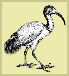
Do you have a regular visitor to your yard, some exotic or delightful creature that makes you smile and whom you eventually regard as your very own mascot? Mine is the ibis, a bird about two feet high that almost always comes in flocks.

Ibises are wading birds who ordinarily feed on crustaceans, but because there are no crustaceans in my yard, I suppose that they have a varied diet. Remember the funny toy bird from decades ago that was made of plastic and sponges? The toy bird plunged his head into a glass of water and then would, through some simple law of physics, eventually become upright again. Well, the ibis makes the same movement, albeit at a more rapid pace. A flock of ibises will land in my lawn and then, with great thoroughness, move across it like a well-practiced and synchronized dowsing team. They have orange bills that tend to be dirty for the first six inches. I think they're drilling for grubs, and the sight is comical and endearing.

Photo by Alice Ruffner
One distinctive feature of the ibis is that it has very blue eyes!

Egyptomania  |  National Gallery of Canada  |  Humbert, Pantazzi, Ziegler
The ancient Egyptians saw the ibis as a sacred bird and deified it.This is an 1888 painting titled Alethe, Attendant of the Sacred Ibis in the Great Temple of Isis at Memphis AD 255, by the artist Edwin Long. It illustrates a tragic story by Thomas Moore of an Egyptian priestess who was secretly Christian, and who became a martyr. Louvre curator Jean-Marcel Humbert notes that Long painted an "implausible" Egyptian costume.


Here I've recreated a hieroglyphic of the ibis god. Known as Tehuti by the Egyptians and named Thoth by the Greeks, he was the counterpart of the Greek's Hermes and the Roman's Mercury. Thoth was usually depicted with a palette and sometimes was crowned with a moon (like Diana). He was lord of the moon, the god of wisdom, writing and invention, and was the messenger and spokesman of the gods. He was also the protector of scribes.

So while I chuckle when I see my ibis friends, this blogger is also honored when they choose my yard for their sustenance!
.