Thursday, July 25, 2013

Tampa Theater, a Grand Movie Palace

Mark D. Ruffner © 2013
Several times a year, I cross Tampa Bay to go to the Tampa Theater, usually to see a good documentary. It's always a special treat.

Mark D. Ruffner © 2013
Tampa Theater was designed by architect John Eberson in 1926. It was hugely popular when it opened because it was Tampa's first public building to be air conditioned. The building's facade hints at the ornate design within.

Mark D. Ruffner © 2013
This ceiling, which strikes me as Venetian in design, is above the ticket booth and extends into the lobby. Elaborate tile patterns are throughout the theater.

Mark D. Ruffner © 2013
mitampabay.com
click to enlarge  |  ignitetampa.org
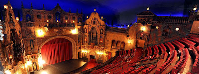
I always gravitate to the balcony, all the better to take in the theater's decor, an ornate architectural facade. The theater is usually darkened, but I was able to shoot the detail below without using a flash.

Mark D. Ruffner © 2013
There's a concert of period music before every showing, when an organ rises from beneath the stage. Just before the movie begins, the organist acknowledges the audience with a wave of his hand, and then the organ descends back down to the basement.

Mark D. Ruffner © 2013
There are several fountains like this one throughout Tampa Theater, and wonderful details at every turn, like the alcove and urn, below.

Mark D. Ruffner © 2013

Mark D. Ruffner © 2013
Amazingly, almost nothing has changed since 1926 — just look at this great sign in front of the men's room. Below is one corner of the men's room, glistening with gold tile. I wouldn't be at all surprised if an attendant sat in that chair at one time.

Mark D. Ruffner © 2013
By 1973, Tampa Theater had fallen on hard times and was in jeopardy of being torn down like so many other great theaters around the country. But the citizens of Tampa rallied behind it, the city assumed its leases and today it's run by a not-for-profit foundation. The Hillsborough County Arts Council manages the films shown at the theater, and holds over 600 events there each year. In 1978, Tampa Theater was named to the National Register of Historic Places.

Mark D. Ruffner © 2013
One last look back as we exit the theater lobby.
.

Friday, July 19, 2013

Victorian Hand Analysis


This card, dating to 1893, was designed by Barbour's in-house art department.  I'm guessing that the artist who designed it consulted Owen Jones' The Grammar of Ornament. And the back of the card is as interesting as the front. So let's proceed to the hand analysis.


(As the newspaper's horoscope always disclaims, this is just for entertainment — I know you're not really an indolent tyrant.)


Oh, oh! I'm not doing well!


 Well, I'm in trouble, but I hope you did better!
 •  •  •
Going back to the beginning of this posting, many 19th-century graphic designers consulted newly published handbooks of historic ornament. The designer of the Barbours card may have used L'Ornement Polychrome, by Auguste Racinet. Here are several samples from that book:

.

Tuesday, July 16, 2013

Creating a Fun Logo

Over the course of my career as a graphic designer, I've designed many logos, including one for a Presidential event. But invariably it's been the smaller, locally based logos that have provided the most pleasure and satisfaction.

I was once asked to design a logo for a small enterprise that made decals for model car racing enthusiasts. The owner owned a dachshund and wanted a racing dachshund to be the logo.

I immediately thought of the one famous logo with a racing dog — the Greyhound Bus logo — and I set about turning a greyhound into a dachshund. Here was the result:

.

Tuesday, July 9, 2013

Micromosaics

Mark D. Ruffner © 2013

My great-grandmother, Emma Breguet, died at a young age, and little of what belonged to her is left. What remains reveals that she gravitated to all things inlaid, including micromosaics. Today I thought I'd share one of her paperweights, apparently a souvenir of Rome.

click to enlarge
Below are the individual sights, and you can click on each of them to enlarge the images. (Because the black marble base has many hairline scratches, I've obscured them so that you might focus more easily on these little masterpieces.)

click to enlarge  |  Temple of Hercules Victor
click to enlarge  |  The Colosseum
click to enlarge  |  Forum Romanum
click to enlarge  |  The Pantheon
click to enlarge  |  Vatican Square
For larger mosaics, glass chips called smalti, below, are used (smalto, singular). For micromosaics, smalti is heated and drawn out into long threads called filati, which in that drawing out become very thin. It is this filati that is used in micromosaics, and it is indeed thin; you can see where filati is missing in areas of the Pantheon, above, and that slight deterioration is essentially a flaking.

mosaicartsupply.com
Above is smalti, huge in comparison to the filati that would be used in micromosaics.

Because the filati pieces are so tiny, beautiful gradations can be accomplished. Look, for example, at how the skies in all the images above gradate to the horizon, and then see what a stunning effect that creates in the first image of the entire plaque.

click to enlarge  |  http://www.lacma.org/search/node/micromosaics 
Above is one of the most spectacular of micromosaics, an image of the Colosseum measuring 18¾ x 25⅞. It's on extended loan to the Victoria and Albert Museum from the Los Angeles County Museum of Art, the Gilbert Collection. This micromosaic was made circa 1850.
.

Thursday, July 4, 2013

The Fine Art of Madeline von Foerster

I have recently become a convert to Pinterest, and one of my first boards is on "cabinets of curiosity." (I've been thinking of doing a painting, or series of paintings, on that venerable way of displaying collections.)

Ex Mare  |  Madeline von Forester
In my Pinterest surfing, I've discovered the great artwork of Madeline von Foerster, and I wanted to share it with you. The piece above, Ex Mare (from the sea, in Latin), is a prime example of von Foerster's craftsmanship and delightful vision. Now look at the bottom shelf and the beautiful rendition of litter, the litter that often kills sea life. Von Foerster has regularly contributed her artwork to the cause of conservation.

Ebony Cabinet  |  Madeline von Forester

Frog Cabinet  |  Madeline von Forester
Donne Unica  |  Madeline von Forester
Madeline von Foerster works in a technique of oil mixed with egg tempera, achieving a look of the Flemish masters. Her work recalls the Northern Renaissance, but incorporates a surrealism that is often a commentary on modern life. (Donna Unica translates as "Women Only.")

Pangolin  |  Madeline von Forester
Collection Cabinet  |  Madeline von Forester
Valentine  |  Madeline von Forester
I hope you have enjoyed these images as much as I have. You can access Madeline von Foerster's own site and see more of von Foerster's art by clicking on the photo of her, below. Be sure to check out her page on technique.

.

Monday, July 1, 2013

Decorative Victorian Typography


click to enlarge
As I've been sharing my collection of antique advertising with you, I've usually concentrated on the fronts of trade cards, which are often beautiful examples of 19th century lithography.

But the backs are sometimes just as spectacular in their decoration and lettering. They're also very imaginative in their design. Look, for example, at the "L" in "Liverpool!"

You'll notice that all of the examples I share in this posting have curved lettering and some degree of bannering.

This example comes from a very small card, only about two inches high. It's greatly enlarged for your viewing.


One final observation that I'd make is that almost all of the typography shown here (if indeed not all of it) is hand-lettered. Just one more reason that I enjoy collecting and studying these little marvels!
.