 |
| The Big Red Purse | © Kenton Nelson |
Kenton Nelson is a California-based artist whose work I would describe as "pared realism." Sometimes, as in this painting entitled
The Big Red Purse, there is a Pop Art quality to his subject matter and magnified views.
 |
| © Kenton Nelson |
 |
| On Providing Support | © Kenton Nelson 2006 |
 |
| © Kenton Nelson |
On Nelson's own site (which you can visit
here) he mentions an affinity for and influence by WPA art, a period to which both Thomas Hart Benton and Grant Wood belonged. I see a little of both artists in Nelson's perspectives, stylization and coloring.
 |
| Conjugation | © Kenton Nelson |
 |
| © Kenton Nelson | © Kenton Nelson |
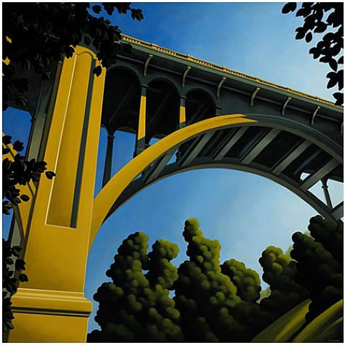
Pasadena's Colorado Street Bridge is a recurring theme in Nelson's paintings. Nelson is a major figure in the preservation of Pasadena landmarks.
 |
| © Kenton Nelson |
Kenton Nelson's work evokes American suburbia of the 1950's, and perhaps his spare detail adds to the feeling of simpler times. Even when Nelson paints figures, there is a sense of isolation and suspended time.
Besides pared detail, Nelson has a very distinctive color palette, one which contributes to the retro quality of his work.
 |
| Mr. Wilkenson | © Kenton Nelson 2007 |
 |
| Saturday's Probability | © Kenton Nelson 2004 |
Nelson's paintings range in size from 12" x 12", like the image above, to what my local museum would call "masterworks," like Big Shoes, seen below at a 2011 New York exhibition.
 |
| kentonnelson.com |
 |
| © Kenton Nelson | © Kenton Nelson |
Kenton Nelson's paintings were featured in the recent movie, Something's Gotta Give, starring Diane Keaton and Jack Nicholson. Look for a poolside painting and a great Edward Hopper-like view of a lighthouse.
 |
| © Kenton Nelson |
I saved my own favorite for last.
.


I immediately thought of Edward Hopper, and then as I read through, I found your reference to him. I agree with you on your choice.
ReplyDeleteColumnist, as I look at that last painting, I can envision designing a very handsome room around it. This particular image reminds me more of the work of René Magritte, though.
DeleteHello Mark:
ReplyDeleteWe find these paintings by Kenton Nelson most appealing. The hyper-realism does give them an 'other worldly' atmosphere and they are, as you say, reminiscent of and yet not exactly comparable with Pop Art images of many decades ago.The highly individual and restrictive colour palette does contribute to this feeling too.
Our favourite is 'The Big Red Purse'. For us, it is filled with impending gloom, enhanced by those exceedingly sinister black gloves.
Hello Jane and Lance:
DeleteI can see your perspective of "The Big Red Purse. In fact, as I look back over Nelson's work, I see a certain mysteriousness that could lend itself to the covers of mystery novels.
Hello Mark, I really like the tree-support picture, and the letter-slot one, but I think my favorites are those of the bridge. Nelson is another artist new to me, and your analysis of his color palette is very effective in helping us understand his work.
ReplyDeleteHello, Jim,
Delete"On Providing Support" and "Big Shoes" have a Pop Art quality, but when I look at the bridge paintings that you like, I see a lot of Grant Wood's influence, particularly in those stylized trees.
I'm glad you like my work with Nelson's color palette. To reach it, I took a digital color sampling of the the two most prominent colors in each painting of a sampling of his work.
Dear Mark - thanks for the introduction to yet another new artist.
ReplyDeleteI enjoy the way you have made the color palette showing the distinctive colours that Kenton Nelson uses.
To me there is a questioning element to his paintings. What is going on in the motorhome? Who is sitting on the tractor? Why is there no sign of life on or below the street bridge or in suburbia? Why is the cafe empty? The absence of humanity gives them a slightly sinister feeling, but I do like them and find them very interesting.
Dear Rosemary - Nelson does indeed paint figures, though they tend to be cropped in a way that makes them mysterious, or in ordinary situations which still have an air of mystery. I've added to more images to the posting in response to your comment.
DeleteThanks for the extra pictures Mark - I like both of those. Nelson really has a unique touch and perspective.
DeleteEnjoyed seeing Nelson's work , he makes inanimate objects seem very sinister and the hands in the first painting are positively evil
ReplyDeleteHello, smr - I've been trying to think of a better, more precise word than "mysterious" to describe Kenton Nelson's paintings and I think it is "cryptic."
DeleteDefinitely Grant Wood, and very neo-pop, a strange marriage. He's very accomplished!
ReplyDeleteAnd apparently very prolific.
DeleteDear Mark,
ReplyDeleteThanks to a little accident I experienced this week, I am way behind in my blog reading so here I am bringing up the rear with my comment.
I never knew about Kenton Nelson before and I find that I really rather like his work. The fact that many of the paintings you have shown here are devoid of people (when you would normally expect them to be there) is intriguing.
But when you think about it, there are times when, for example, you are standing in a street, in a busy city, but for the briefest of moments you suddenly find that there is no one 'about'. You are the only person there - and then it all changes and people come round the corner, open doors, drive past etc. I think that many of Mr. Nelson's paintings seem to illustrate such moments. That is what makes them, as you say, cryptic.
By the way, I'm with you because when I saw that last image I thought 'I like that'.
Dear Kirk,
DeleteFirst, I hope you are okay and in no way inconvenienced.
I often look at art from the perspective of whether or not I would want to live with it, and that last image passes the test. Perhaps it evokes a time and place in my own life. It speaks of a certain time of day and the passage of time, and I like that, though it might be melancholy. And I like its sense of order.
Hi, Mark - I definitely would have to agree: isolation! As if the entire town had been abandoned. And some of his paintings are similar to Edward Hopper's pieces. I also love that last painting: wonderful architecture and such lighting / shadows.
ReplyDeleteHi, Loi - So many of my fellow bloggers are agreeing with my pick of the last painting, that I'm guessing it appeals on a deeper level of consciousness. Perhaps it is that it has a dream-like quality.
DeleteDear Mark,
ReplyDeleteSo sorry to have arrived late to the party! I've been swamped at the bindery and am just now allowing myself some time to enjoy reading your always-fascinating posts!!! Thank you for introducing me to Kenton Nelson-- what interesting work. I agree with all of the comments above connecting Nelson to Hopper-- but there is also a feeling of California about these pictures, don't you think? Perhaps its the experience of living in the light there that has informed Nelson's palette and aesthetic... It reminds me of work by a Detroit artist, Stephen Magsig, who paints a small painting everyday as a part of his studio work-- he's one of the only full-time, non-academic studio painters I know. You might enjoy seeing his work: http://myartspage.blogspot.com/ I think you'll see that his work, like Nelson's, is deeply affected by a sense of place-- so interesting! Thanks so much for sharing Kenton Nelson's work with us.
Warm regards,
Erika
I'm late to the party as well, Mark. Thanks for sharing the work of an artist I'd never heard of before. I love that you're doing more art posts lately.
ReplyDeleteI'm working on a post for next week on the work of an artist who may impress you. Coincidence: slightly similar to Nelson's work though different in technique.
P.S. I love the stillness of Nelson's work.
Stillness — I like that description of Nelson's work. Maybe that's why I like it so much, that time might be suspended.
DeleteI look forward to seeing the artist of your choice!