Monday, October 11, 2010
Pedestrian Revise
Consider the poor pedestrian. Footless and without hands, he plods along with nary a thought in his bubble head. And the really sad part of it all is that he's meant to represent both you and me. The image has bothered me for as long as I've looked at this fellow, and I think it's high time we did something about it! So let's restore his appendages, introduce fun accessories, and finally give our little guy some long-deserved personality.
Friday, October 8, 2010
Florentine Architecture in Florida
Last month I showcased St. Petersburg's Snell Arcade, a high rise of Venetian grandeur. Right next to the Snell Arcade is the Open Air Post Office, which is Florentine.
The Open Air Post Office was built in 1916 and derives its name from the loggias that permit around-the-clock access to post office boxes. The style is properly called Mediterranean Revival, but it's actually pure Florentine.
The design for the post office was inspired by Florence's Ospedale degli Innocenti, designed by Filipp Brunelleschi in 1424. (Brunelleschi is famous for having designed the dome of Florence's cathedral, popularly known as the Duomo. Brunelleschi's dome was an engineering feat, and remained the largest dome in the world until the 20th century.)
![]() |
| Brunelleschi's Ospedale degli Innocenti, Florence, Italy |
![]() |
| The Open Air Post Office, St. Petersburg, Florida |
![]() |
| Dolphin and shell capital |
Labels:
architecture,
Brunelleschi,
Duomo,
Florentine,
George W. Stuart,
Open Air Post Office,
Ospedale degli Innocenti
Wednesday, October 6, 2010
My Whale Poster
I spent several years working for an adjunct of the newspaper called NIE (Newspaper in Education). The purpose of NIE is to encourage literacy and readership in the classroom, and to provide reading programs to students and teachers – at no cost. Perhaps you remember receiving the American Scholastic magazine in your own classroom when you were growing up. (I did, and it always made me feel more adult.) Well, the NIE publications are very much like that. Designing tabloids and posters for children brought me full circle, and I always designed with the young Mark in mind.
NIE publications are sponsored by corporations, and this whale poster was sponsored by SeaWorld of Orlando. A designer's work is always made easier when a client provides reference material as beautiful as SeaWorld's. Initially, I wanted to have the whole inside of the poster just the photograph of the man and the whale swimming "hand in hand." (Did you know that within the whale fin, there are five digits?) But the photo resolution wasn't high enough, so I came up with the design above instead. It worked out better that way for two reasons: 1) the curved shape mirrors both the whale and the world map, which makes for a more interesting design, and 2) there is a balance of type that is reversed and not reversed, so the eye doesn't have to work quite as hard. This poster was folded into quadrants, so I designed the folds to hit a minimum of type.
Monday, October 4, 2010
Sunday, October 3, 2010
Trompe l'Oeil Corner
Above is a corner within my house where the dining room meets the living room. If you were to enter and walk through the house, you'd think nothing of that corner. But actually, you'd be looking at a painted shadow.
This is a schematic of the photo above. My living room flows into a small dining area that's practically a nook. Light comes in through two sources, French doors to the south and one window to the north. Because light is very diffused, I've mirrored one living room wall, floor to ceiling, then painted the other walls a light yellow (A). That does little, however, to lighten the back wall of the dining room (B), which is in shadow. Of course I could have painted that wall and wall C a yet lighter yellow, but those walls would then have become pretty anemic. Besides, I wanted wall C to be strong enough to complement the kitchen beyond, which is a yellow-orange.
And so I hit upon the idea of accentuating the shadows instead. These are the colors I used:
I know, you're looking at that Golden Pearl and thinking it looks pretty raw. But if you look at the top photo again, you might agree that it looks less like Golden Pearl and more like the dark shadow of Buttercup. In fact, when one looks into the dining area, it appears to all be one color. What makes that work is that wall B, which is Rattan, is a perfect bridge between the other two, and no one looking at the Rattan wall would ever know that it too is a painted shadow.
When we're painting walls, we're really playing with light. We can make walls appear larger or smaller, warmer or cooler, lower or higher. And, we can even make a shadow appear crisper!
P.S. Light yellow is a particularly changeable color, and I had to paint my living room walls four times to get the right look. Some yellows looked bad in my particular lighting and some yellows looked absolutely green in the mirror reflection!
Thursday, September 30, 2010
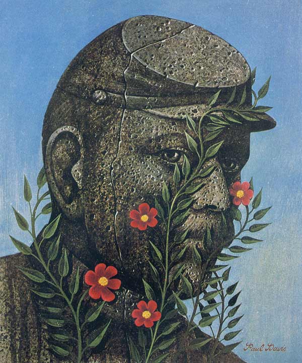
Illustrator Paul Davis
If you went to a Broadway show in the 1970s or 1980s,
you will remember the work of Paul Davis.
Davis (b. 1938) was a member of Milton Glaser's Push Pin studios,
which revolutionized the advertising world of that time.
He had a unique style, one that hearkened back to early
20th century posters and road signs.
which revolutionized the advertising world of that time.
He had a unique style, one that hearkened back to early
20th century posters and road signs.
Though art directors initially balked at using his style -
which had a decidedly folk art look -
Davis became quickly popular and worked for many big clients.
which had a decidedly folk art look -
Davis became quickly popular and worked for many big clients.
He often did commercial jobs by painting on wood.
As you can see, Davis had a very earthy palette,
which helped make his work instantly recognizable.
I don't remember the source, but I have this note in my files on him:
"In January 1976, Paul Davis made a trip around the world.
His carry-on bag held six little canvases and nine colors:
• yellow oxide • cadmium yellow light • cadmium red light
• green oxide • burnt sienna • burnt umber
• phthalocyanine blue • napthol crimson • cerulean blue."
• green oxide • burnt sienna • burnt umber
• phthalocyanine blue • napthol crimson • cerulean blue."
In light of the Internet, it's interesting to read this headline, isn't it?
Though not a particularly political person,
Paul Davis' work supported a number of liberal causes.
His iconic poster of Che Guevara outraged many,
and Davis was both surprised and frightened when the lobby of
the political journal Evergreen was firebombed because of it.
Paul Davis' work was influenced by American folk painters
like Edward Hicks, American Regionalists like Thomas Hart Benton,
and the Belgian Surrealist, René Magritte.
Paul Davis is still painting, though he has moved away
from advertising and editorial art.
Labels:
Broadway posters,
Che Guevara,
Edward Hicks,
illustration,
Milton Glaser,
Paul Davis,
Push Pin studios,
René Magritte,
Thomas Hart Benton
Wednesday, September 29, 2010
Two Shields
There's a poky fellow who's been wandering back and forth across my back yard for weeks, and the fact that he's decided to hang around has given me great pleasure. I took this photograph, and when I researched his beautiful design, I discovered that he is an Ornate Box Turtle. His proper name is Terrapene Ornata.
His design rattled around in my head because I remembered seeing the pattern somewhere else. It reminds me of this antique shield from New Hebrides.
Now I wonder if they have turtles on Vanuatu, and wouldn't it be interesting if there was a connection?
Labels:
New Hebrides,
shield,
terrapene,
turtle,
Vanuatu
Subscribe to:
Posts (Atom)


