Friday, October 15, 2010

John Wanamaker


At the very beginning of my career, I worked for a company that designed gift catalogs for John Wanamaker, the fashionable Philadelphia department store. The store's logo is based on John Wanamaker's actual signature, and it intrigued me. Like the rest of his handwriting, the signature letters form straight lines of ascending and descending steps. This was certainly an unusual personality, so much so that I was inspired to learn more about graphology, and about John Wanamaker, the man.

An analysis of Wanamaker's handwriting reveals a highly creative person who was of a naturally hopeful and buoyant disposition, coupled with caution, doubt and self-control. In other words, the pragmatic optimist. This was indeed the personality who came to be known as the "Father of Modern Advertising."

Wanamaker (1838-1922) was blessed with the ability to see opportunity in the worst of situations, and so it must have seemed that he had the Midas touch. He started a clothing store with his brother-in-law in 1861, at the beginning of the Civil War. That was the absolute worst time to start a clothing business because the cotton industry was, of course, in a state of shambles. In those days all clothing was tailored to the individual, and during the war many tailors were left with unclaimed orders. John Wanamaker regularly traveled from Philadelphia to New York to buy, at low cost, such seemingly bad debts. These he then turned around and sold in his own store as the first off-the-rack clothing.

As many tailors failed, Wanamaker's business flourished. A great part of his success was the Wanamaker philosophy of a firm price, with satisfaction guaranteed or money back. We might take such policies for granted now, but in that time, most stores didn't have fixed prices, and haggling was the rule of the day.


John Wanamaker also regularly plowed a good portion of his profit back into advertising, and it was he who was responsible for the first full-page newspaper ad. To that innovation he also contributed an appreciation for advertising white space, which undoubtedly had a profound impact upon a public used to small headlines and lots of fine print.

Wanamaker was a visionary so far ahead of his time that he foresaw shopping malls before department stores were even popular! In fact it was because other merchants could not bring themselves to join in the mall vision that Wanamaker instead developed the first modern department store. Others had been built before, but Wanamaker's was the first as we know department stores today, with individual managers and specialized sales personnel.

Fifteen years after his original 30' x 80' store, Wanamaker built the Grand Depot, the country's largest store. On opening day, 70,000 people attended, including President and Mrs. Grant. The Grand Depot was the first department store to use electric lights, pneumatic tubes, and a ventilation fan system.

From my advertising collection, trade cards of Wanamaker's first store, and of the Grand Depot
No matter how successful he became, Wanamaker continued to walk the aisles of his store, often slipping behind the counter to assist in a sale. He also continued to think up progressive advertising schemes, which led to $2.98-type pricing, the first white sale, and ultimately, department store history's first million-dollar sales day. Anyone who says, "The customer is always right!" is quoting and paying tribute to our premier advertiser.

John Wanamaker became Postmaster General in 1889 and in that capacity founded Rural Free Delivery. That in turn paved the way for other success stories, notably that of Montgomery Ward and Sears, Roebuck.

The front and back of a well-worn Wanamaker prime
In the age of "robber barons," Wanamaker was a notable exception. He took a personal interest in the welfare of his employees and their families, he took an active role in education, and he was this country's first secretary of the YMCA.


A spring fashion catalog cover I designed for John Wanamaker

Tuesday, October 12, 2010

Ancient Urban Planning


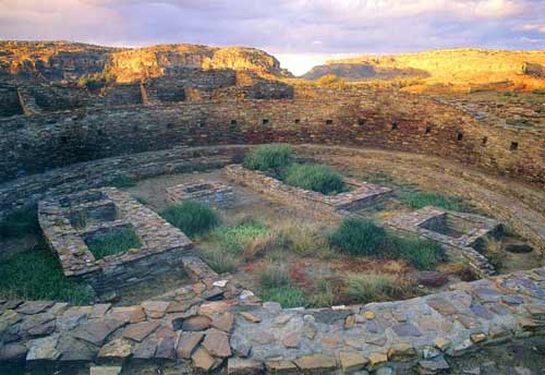
Several years ago, my nephew and I visited the center of the Anasazi culture in Chaco Canyon, New Mexico. The Anasazi were the ancestors of the Hopi and Navajo, and their name means "ancient ones." From 800-1200 A.D., the Anasazi built a most remarkable city that has the mark of modern urban planning.

Original painting by L. Kenneth Townsend for Reader's Digest

There are a number of building sites in Chaco Canyon, but the primary one is a D-shaped structure known as Pueblo Bonito. Pueblo Bonito was discovered by a U. S. Army expedition in 1849, and was excavated from the 1870s into the 20th century. Above is an 1880s archeologist and an aerial view of Pueblo Bonito today. The two bottom images show the site as it would have appeared in Anasazi times.

Pueblo Bonito contained more than 600 rooms and 40 kivas (round ceremonial chambers). The Anasazi transported thousands of trees many miles for timber, they devised a sophisticated watering system, built raised plazas for ceremony and established approximately 400 miles of roads. Some roads were 30 feet wide and in straight segments for 40 miles.

The Great Kiva — this is a community center the size of a small stadium.
The Anasazi were great masons. These bricks may appear to be adobe, but they are all cut stone. Archeologists date different building periods by the evolving masonry styles. The bottom right example is the late period, the mid-1100s A.D.


My favorite photo from the trip. I call it "Inner Sanctum."


Holes for rafters indicate that the canyon face was used as a back wall for apartments.
From 1921 to 1927, Neil Judd headed an archeological excavation funded by the National Geographic Society. One of his interesting discoveries was that the burial grounds were not big enough to reflect the huge population that would have inhabited Pueblo Bonito. Judd concluded that the center was not fully inhabited year round, and that there were seasonal influxes of distant tribes for ceremonies.

Those photographs not my own were taken by George H. H. Huey
and are courtesy of the Western National Parks Association.

Monday, October 11, 2010

Pedestrian Revise


Consider the poor pedestrian. Footless and without hands, he plods along with nary a thought in his bubble head. And the really sad part of it all is that he's meant to represent both you and me. The image has bothered me for as long as I've looked at this fellow, and I think it's high time we did something about it! So let's restore his appendages, introduce fun accessories, and finally give our little guy some long-deserved personality.


Friday, October 8, 2010

Florentine Architecture in Florida


Last month I showcased St. Petersburg's Snell Arcade, a high rise of Venetian grandeur. Right next to the Snell Arcade is the Open Air Post Office, which is Florentine.


The Open Air Post Office was built in 1916 and derives its name from the loggias that permit around-the-clock access to post office boxes. The style is properly called Mediterranean Revival, but it's actually pure Florentine.

The design for the post office was inspired by Florence's Ospedale degli Innocenti, designed by Filipp Brunelleschi in 1424. (Brunelleschi is famous for having designed the dome of Florence's cathedral, popularly known as the Duomo. Brunelleschi's dome was an engineering feat, and remained the largest dome in the world until the 20th century.)

Brunelleschi's Ospedale degli Innocenti, Florence, Italy
The Open Air Post Office, St. Petersburg, Florida


Dolphin and shell capital
The architect of the Open Air Post Office was George W. Stuart (1856-1937), who lived a most colorful life. He was born in Scotland, was educated in Ontario, Canada, and apprenticed as an architect in Toronto. He fought against the Sioux and Blackfeet Indians in Canada's last Indian War and survived being shot in the neck with an arrow. Stuart lived in Dallas and Atlanta before finally settling in St. Petersburg, where he designed many residences.

Wednesday, October 6, 2010

My Whale Poster


I spent several years working for an adjunct of the newspaper called NIE (Newspaper in Education). The purpose of NIE is to encourage literacy and readership in the classroom, and to provide reading programs to students and teachers – at no cost. Perhaps you remember receiving the American Scholastic magazine in your own classroom when you were growing up. (I did, and it always made me feel more adult.) Well, the NIE publications are very much like that. Designing tabloids and posters for children brought me full circle, and I always designed with the young Mark in mind.


NIE publications are sponsored by corporations, and this whale poster was sponsored by SeaWorld of Orlando. A designer's work is always made easier when a client provides reference material as beautiful as SeaWorld's. Initially, I wanted to have the whole inside of the poster just the photograph of the man and the whale swimming "hand in hand." (Did you know that within the whale fin, there are five digits?) But the photo resolution wasn't high enough, so I came up with the design above instead. It worked out better that way for two reasons: 1) the curved shape mirrors both the whale and the world map, which makes for a more interesting design, and 2) there is a balance of type that is reversed and not reversed, so the eye doesn't have to work quite as hard. This poster was folded into quadrants, so I designed the folds to hit a minimum of type.


By clicking on this image, you might be able to read some of the interesting facts about whales. Remember though, that this was not printed on glossy paper, which would have made the type sharper, but rather on newsprint. The ink on newsprint bleeds 15% into the paper, which is of course very absorbent, so the clarity of this detail and reversed type is a real testament to the excellent calibrating that happens in both the photography and printing setups at the newspaper.

Monday, October 4, 2010

The Micro/Macro of a Drawing


This incredible drawing is the work of
RODNEY JONES,
the greatest self-taught artist I've ever met.


Sunday, October 3, 2010

Trompe l'Oeil Corner


Above is a corner within my house where the dining room meets the living room. If you were to enter and walk through the house, you'd think nothing of that corner. But actually, you'd be looking at a painted shadow.


This is a schematic of the photo above. My living room flows into a small dining area that's practically a nook. Light comes in through two sources, French doors to the south and one window to the north. Because light is very diffused, I've mirrored one living room wall, floor to ceiling, then painted the other walls a light yellow (A). That does little, however, to lighten the back wall of the dining room (B), which is in shadow. Of course I could have painted that wall and wall C a yet lighter yellow, but those walls would then have become pretty anemic. Besides, I wanted wall C to be strong enough to complement the kitchen beyond, which is a yellow-orange.

And so I hit upon the idea of accentuating the shadows instead. These are the colors I used:


I know, you're looking at that Golden Pearl and thinking it looks pretty raw. But if you look at the top photo again, you might agree that it looks less like Golden Pearl and more like the dark shadow of Buttercup. In fact, when one looks into the dining area, it appears to all be one color. What makes that work is that wall B, which is Rattan, is a perfect bridge between the other two, and no one looking at the Rattan wall would ever know that it too is a painted shadow.

When we're painting walls, we're really playing with light. We can make walls appear larger or smaller, warmer or cooler, lower or higher. And, we can even make a shadow appear crisper!

P.S. Light yellow is a particularly changeable color, and I had to paint my living room walls four times to get the right look. Some yellows looked bad in my particular lighting and some yellows looked absolutely green in the mirror reflection!