Thursday, September 30, 2010

Illustrator Paul Davis


If you went to a Broadway show in the 1970s or 1980s,
you will remember the work of Paul Davis. 


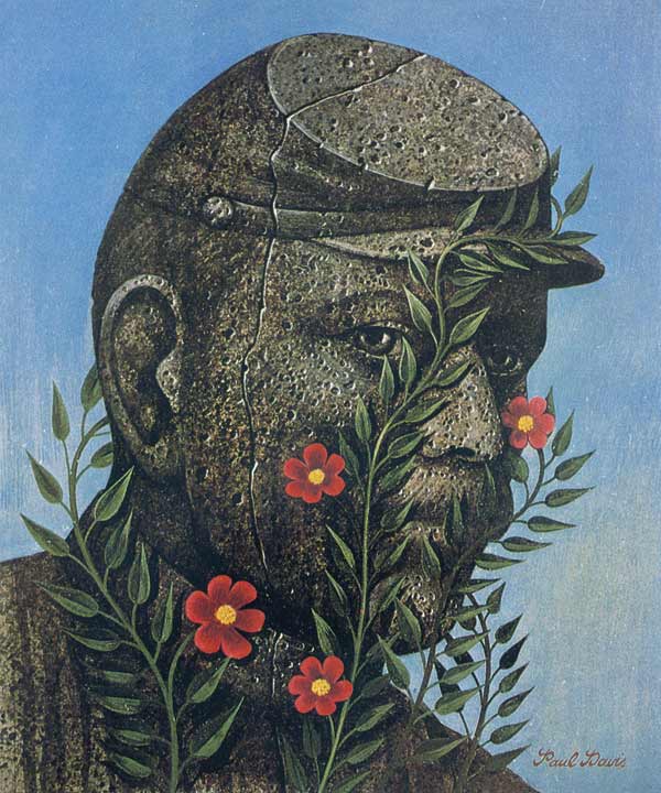
Davis (b. 1938) was a member of Milton Glaser's Push Pin studios,
which revolutionized the advertising world of that time.
He had a unique style, one that hearkened back to early
20th century posters and road signs.


Though art directors initially balked at using his style -
which had a decidedly folk art look -
Davis became quickly popular and worked for many big clients.


He often did commercial jobs by painting on wood.
As you can see, Davis had a very earthy palette,
which helped make his work instantly recognizable.
I don't remember the source, but I have this note in my files on him:

"In January 1976, Paul Davis made a trip around the world.
His carry-on bag held six little canvases and nine colors:

• yellow oxide • cadmium yellow light • cadmium red light
• green oxide • burnt sienna • burnt umber
• phthalocyanine blue • napthol crimson • cerulean blue."


In light of the Internet, it's interesting to read this headline, isn't it?


Though not a particularly political person,
Paul Davis' work supported a number of liberal causes.
His iconic poster of Che Guevara outraged many,
and Davis was both surprised and frightened when the lobby of
the political journal Evergreen was firebombed because of it.


Paul Davis' work was influenced by American folk painters
like Edward Hicks, American Regionalists like Thomas Hart Benton,
and the Belgian Surrealist, René Magritte.


Paul Davis is still painting, though he has moved away
from advertising and editorial art.

Wednesday, September 29, 2010

Two Shields


There's a poky fellow who's been wandering back and forth across my back yard for weeks, and the fact that he's decided to hang around has given me great pleasure. I took this photograph, and when I researched his beautiful design, I discovered that he is an Ornate Box Turtle. His proper name is Terrapene Ornata.


His design rattled around in my head because I remembered seeing the pattern somewhere else. It reminds me of this antique shield from New Hebrides.


Now I wonder if they have turtles on Vanuatu, and wouldn't it be interesting if there was a connection?

Monday, September 27, 2010

Medici Giveaway

Fun With My Profile Portrait


A reader (and fellow blogger) has suggested that I show more of my profile picture, and talk a little about it. So here’s the story:

I chose to use a portrait of Federico da Montefeltro, who was the Duke of Urbino from 1474 until his death in 1482. He rose in power by heading a mercenary army, and he is famous for having had tremendously loyal men, and for never having lost a war. The portrait was painted around 1465 by Piero della Francesca, a lover of mathematics who is credited today for having been a pioneer in the understanding of perspective.

There’s an interesting story behind da Montefeltro’s remarkable appearance. He lost his right eye in a jousting match, and because he feared assassination attempts, he had the bridge of his nose removed to afford better visibility with his remaining eye.

Called “The Light of Italy,” da Montefeltro was highly cultivated and amassed a library that was second only to the Vatican’s.


This portrait of da Montefeltro with his son captures his dual passion for things military and literary. He's wearing the Order of the Garter, which was awarded to him by England's King Edward IV.


Working in the program Adobe PhotoShop, I began my profile picture by removing da Montefeltro's face and filling in the background. Naturally, I didn't need to refill the background completely (because a new face would go over it), but it's not my nature to leave holes in work, even when they're unseen! Next, I separated the body and hat into their own layers so that I'd be able to manipulate them without disturbing the background. Finally, I inserted my own face on a fourth layer - it's a shot from a digital camera. I lopped off the top of my head in a random sort of way (words I hope never to repeat) so that it would fit all the more easily under the hat. I then airbrushed almost completely over my photo so that it would match the style of della Francesca's painting.


Here's a detail, showing how the face is actually very stylized.

A comparison of the original and final images. In my version, the sky is a little darker and the hat has been stretched to fit my own head. I've also made the texture of the hat and the sleeve a lot smoother. There is some blotchiness in della Francesca's original, which might be due to age. Working on this image was my own way of time traveling, and it was great fun.

Friday, September 24, 2010

Buying Just One Button


I like to wear baseball caps, though that’s really not my persona. So a while back, I thought it would be fun to buy a well-made baseball cap and turn it into a stylish statement. My idea was to get something plain (which turned out to be a dark blue wool cap from the GAP) and then sew one antique button on the front. I imagined the result would provide a look that was quasi-military, or perhaps Victorian, in an Abner Doubleday sort of way.

After I found the cap, it was time to go antiquing. My first stop was a antique shop where there wasn’t a button in sight. “Are you looking for anything in particular?” said the owner. When I casually mentioned buttons, the owner produced - from behind the counter - the estate of a national button club president! On my very first try, I’d hit the mother lode! And in that one moment of supreme manifesting, my search for one antique button became a wealth of buttons that continues to grow to this day. Now I’m hooked on antique buttons!


My antique buttons. I’m particularly attracted to buttons that have Greek and Roman faces, which apparently was a popular theme.

My friend Martha gave me this beautiful book by Diana Epstein and Millicent Safro, with a foreword by Jim Dine and a preface by Tom Wolfe, no less! Below it are seven of my favorites from the book. They remind me of a set of similar dog buttons I had on a childhood vest.


The authors run a most wonderful store in New York, called Tender Buttons. I hesitate to link to their site for fear that you will go on a button spending spree before I get there.


They say that the emerald buyers in Hong Kong wear sunglasses on their rounds. That way the dealers won’t be able to see their eyes dilate as they feast upon the emeralds in which they're really interested. Perhaps I’ll have to wear my sunglasses when I visit Tender Buttons!

Thursday, September 23, 2010

Bend 25 Cents with Just Two Fingers!


Oh, you thought I was talking about bending metal coins! No, no, I wouldn't want you to hurt yourself.


These fractionals are a gift from my good and generous friend, Sandy!

I'm talking about an unusual aspect of United States currency called the "fractional." (The fellow above is Robert J. Walker, who was President Polk's Secretary of the Treasury, from 1845-1849.)


The fractional was an unusual phenomenon that lasted from 1862 to 1876. It seems that as the Civil War loomed, people started hoarding coins. Different measures were tried to counter that, even including the production of wooden nickels ("Don't take any wooden nickels!"), but finally the federal government settled on these mini-bills. This one measures 2" x 3.5" - the size of a standard business card.


Canada issued its own fractionals; this one is dated January 2nd, 1900.

My advice is to buy a fractional and then defray the cost by winning bets based on whether or not you can bend twenty-five cents (you'll have to be careful in your wording). Then you'll start making money to support your habit, whatever that might be. Mine is buying more antique paper!

Tuesday, September 21, 2010

Snell's Hidden Treasure

 
Following up on my last posting, which was on the exterior of the Snell Arcade, is this scene from the inside. It's a mosaic of Venice's Santa Maria della Salute, and measures approximately five feet wide. It's surrounded by a very Mediterranean tile border.


The amazing thing about this mosaic (shown here in its entirety) is that at some point it was covered over with plaster board, and then forgotten for decades. It was rediscovered during renovations, and was a big, happy surprise.


Saturday, September 18, 2010

Venetian High Rise in Florida


Architect Design™'s gorgeous September 1 posting on the OAS building, and his equally exciting September 6 posting on the Pan American building - both in Washington, D.C - inspired me to share the Snell Arcade with you. It was built 18 years after the other two (1928) but has some of the same decorative feel. And yet it is different; I would describe the Snell Arcade as Mediterranean Deco (my own label).

The Snell Arcade is at the main intersection of downtown St. Petersburg, Florida. Officially called the Rutland Building, it is familiar to one and all by the name of Snell. C. Perry Snell was a major developer of St. Petersburg, and it's clear that his own vision was to create on a grand European scale. He favored wide boulevards lined with statuary, and beautiful Mediterranean architecture.


Maybe this should be called Venetian Deco. What do you think?  I've always had a secret desire to completely dismantle the Snell Arcade and reassemble it into my own two-story house. Scale might be a problem, but I'd make it work.


Look at the narrow strips of blue tile between the courses of stone block! Would anyone have the panache to do that today?


The base of the Snell Arcade is made from coral, a practice that has been banned more recently, of course. In my next posting, I'll show you a little treasure inside the Snell Arcade.

Thursday, September 16, 2010

Mandala Meditations

This past Monday I conducted a mandala workshop for the Regional Expressive Arts Practitioners (REAP). I think it went well and that everyone had fun. Thanks to Kathy Luethje for organizing the evening, and thanks to everyone who attended!


I believe, as Carl Jung did, that the mandala is a healing tool, and that to create a mandala is a form of healing meditation. So when I create mandalas, I'm conscious of centering and going inward. My mandalas tend to incorporate the color spectrum associated with the body's chakras, or energy points. Therefore the outer rings will be red, denoting centering of the physical body, and move inward through the spectrum to violet, giving energy to the cerebrum. In the case of the mandala above, painted in acrylics, my theme is gold, so the center focal point is also gold. (The design of white dots is actually the atomic symbol for gold.)


I prefer to make mandalas loosely and with magic markers, like the one above. At this stage, I'm not concerned with making everything perfectly symmetrical. Instead, I'm in a creative zone and working fast. With the mandalas drawn by hand, the process is my focus, not the finished product. Such mandalas can be refined later (because I believe looking at a beautiful, pristine mandala is a meditation in itself), but the designs at this loose stage often have more energy and power.


I also create mandalas on the computer, usually after having worked out the design in pencil, or with magic markers. My computer mandalas can often be other-worldly.


Here are nine mandalas that serve as corporate logos. Left to right and top to bottom: Pilkington Glass, Mercedes-Benz, Target, Accelrys, Google Browser, Yamaha, CBS, Tupperware and Korean Air.

Monday, September 13, 2010

Guilloche and Fabergé


In my last post, I showed a sample of Asher B. Durand's banknote engraving. In the top middle of that specimen sheet, you'll see a rosette. It's an example of guilloche, which is the wonderful pattern of parallel intertwined lines that we all associate with currency security.


This is a detail of a Swiss banknote from the 1970s. Isn't it wonderful? Designers of European currency positively exult in guilloche.


Now, here's a different kind of guilloche. The term also applies to the engraving of the pattern on metal, usually then enameled in the style of Peter Carl Fabergé. In fact, the word comes from Guillot, the engineer who invented the guilloche engraving machine.


When his wealthy patrons would commission an enameled piece from Fabergé, he would show them this chart of guilloche chips, to help them make decisions. Imagine the delight of such choices! This is an illustration from The Art of Carl Fabergé, by A. Kenneth Snowman. While writing his excellent book sixty years ago, Snowman corresponded with and interviewed Fabergé's sons, and also surviving Fabergé craftsmen.


This is a pillbox from my own collection. I bought it while I was in high school, and shortly after reading Snowman's book. When I saw this in an antique shop, I realized that it was a fine design and probably as close as I'd get to owning a Fabergé creation. I based that not just on the flawless enameling, but also because the lid is seamless. If you study Fabergé's work, you'll find that he excelled at hiding hinges and clasps. Many of his eggs opened with the press of a jeweled button. Here, I've placed the pillbox on top of a portrait of Fabergé, though in fact the box is English silver.


And finally, for my architect friends, guilloche also refers to this particular design of intertwined ribbons, which is often found in Greek and Roman architectural detailing.