Showing posts with label illustration. Show all posts

Sunday, December 15, 2013

A Christmas Tribute To Thomas Nast

In my last posting I mentioned how I developed a technique of drawing with felt-tip markers, creating "nubby" lines that have an antique look. As part of the same campaign, John Atkinson and I promoted the shopping center with a Santa Claus modeled after Thomas Nast's famous image. In my illustration, Santa is holding products that could be found at the shopping center.

click to enlarge   |   © Mark D. Ruffner, 1983
Here is my illustration, and below is the 1862 original. I didn't want to lose that distinctive 18th-century clay pipe!

billcasselman.com
While Thomas Nast (1840-1902) defined the American perception of Santa Claus for decades, he is better remembered as the finest 19th-century American political cartoonist. He is the man who came up with the iconic elephant to represent the Republican party, and while he didn't create the donkey as a Democratic emblem, he popularized it.

click to enlarge   |   artintheage.com
Nast began newspaper work while still a teenager, and worked for both Frank Leslie's Illustrated and Harper's Weekly. He used photographs as reference for his stinging caricatures, and was instrumental in bringing down the powerful New York politician, Boss Tweed. When Boss Tweed fled the country on corruption charges and was apprehended in Spain, it was a Thomas Nast cartoon that identified him. Nast's cartoons are also credited with helping Grover Cleveland become the first Democratic President (in 1884) since the 1856 election.

In 1902, President Theodore Roosevelt rewarded the ailing Thomas Nast by appointing him as Consul General to Ecuador. There Nast contracted Yellow Fever while helping others to escape a similar fate, and died the same year.

.

Thursday, December 12, 2013

Nostalgia, Bleeding and Cutting

When I worked as a commercial illustrator, I was not known by any one particular style, and so I developed a range of styles, and that kept me busy.

click to enlarge   |   © Mark D. Ruffner, 1983
This was a full-page newspaper ad I illustrated one Christmas for a local shopping center. For the line art I developed a technique of drawing on thick, absorbent paper with a felt-tip marker. The felt-tip marker would bleed, but slowly so, allowing me to control the line's "nubbiness." Note how I put my initials on the rocking horse's rear, where a brand would be!

The art director for this job was my good friend John Atkinson, with whom I worked on many fun projects — he came up with the concept (and I've mentioned him before, here). Together we spent one evening cutting amberlith overlays for each color.

George Rorick On Using Amberlith   |   www.channels.com/episodes/15488588
This job was done before the days of the computer, so each individual color would be indicated on an amberlith overlay.

Amberlith is a sheet of acetate that is covered with an orange gel that is both semi-transparent and peelable. The amberlith is placed over the artwork, and the areas for one particular color are cut with an exacto blade so that the amberlith covers those areas, and all the rest is peeled away. The step is repeated for each color, and then registration marks are put on each acetate so that all the colors register at printing time.

Producing full-color ads this way was a tedious job, and I sometimes created ads that had more than 20 color overlays! The Christmas ad above required only five.

While this process is now very much outdated in the digital world, it was the norm in newspaper work well into the 1990s.
.

Wednesday, November 20, 2013

Designing a Conestoga Wagon

click to enlarge   |   Illustration by Mark D. Ruffner, 1973
My blogging friend Gina of Gina Ceramics recently posted a riveting story about a pioneer family and the scary maneuvering of their Conestoga Wagon. You can read about it here. The story reminded me that I had done an illustration of a Conestoga for the Scott Paper Company, back in the 1970s.

I stained balsa wood blue and inset it into an illustration board, then drew around the sunken "implant" with colored pencils. Today, of course, I'd do it in half the time digitally.

Conestoga Wagons were made by the Pennsylvania Dutch in Lancaster County, Pennsylvania. Because the Pennsylvania Dutch cartwrights traditionally painted their wagons blue, and the Pennsylvania Dutch wheelwrights traditionally painted their wheels red, the Conestoga wagon is almost always seen in this color combination.

Illustration by Robert Layport, 1973
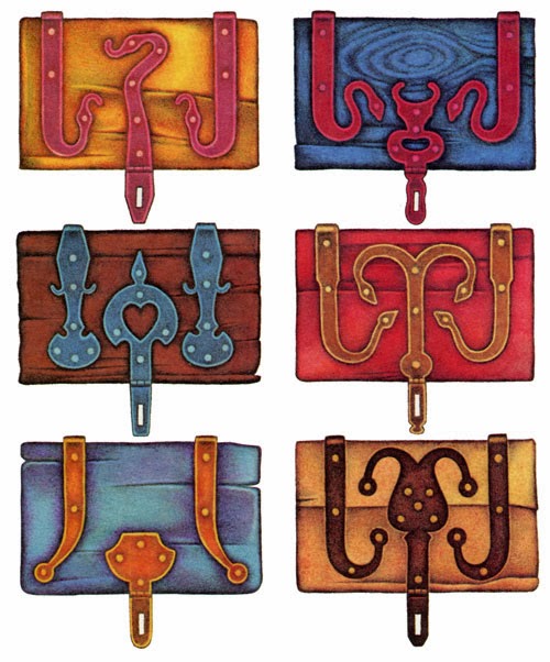
The toolboxes that hung on the side of the wagon had wrought iron hinges, and the hinge designs, also coming from Lancaster County, are evocative of German metalwork.

Illustration by Paul Rendel or John Banks, 1973
Quoting from the Scott Paper sample: "Shoeing a wheel in a hot cloud of sweat, steam and smoke. Iron rims were cut a full ¾ inch smaller than the circumference of the wheel. They were heated red hot, sledged into place, then doused with water. The iron contracted violently, tightened all the wooden joints, and further emphasized the "dish" in the wheel."

click to enlarge

click to enlarge   |   Scott Paper Company
The Conestoga Wagon was used in the early 1700s when colonial settlements were established in the Appalachians, and into the late 1800s, as pioneers moved all the way to the West Coast.
.

Monday, September 30, 2013

A Sweet Treat For You

Mark D. Ruffner, 1984
I was sorting through my flat file recently and came upon an illustration I did for a Florida magazine almost 30 years ago. The idea was that if one subscribed to Florida Trend, the new subscriber would be rewarded with a baker's dozen of fresh donuts.

Mark D. Ruffner, 1984
The mailer was designed to arrive looking like a closed baker's box, sealed with an adhesive tab. When one lifted the cover . . .

click to enlarge   |   Mark D. Ruffner, 1984
. . . there would be a dozen juicy, glazed donuts! I achieved the illustration with a mixture of acrylics, airbrushed dyes, pencil and charcoal.

illustration by Paul Davis
I looked to the great illustrator Paul Davis for style. Paul Davis continues to be a source of inspiration, and you can read my posting about him and his iconic work here.

Mark D. Ruffner, 1984
Also inside the mailer was a die-cut 13th donut, redeemable at our local supermarket.

There have been some professional hazards connected with being a commercial artist, and one of them was that in order to complete this particular assignment, I went through two dozen glazed donuts!

Have a great week, and don't overdo.
.

Tuesday, July 16, 2013

Creating a Fun Logo

Over the course of my career as a graphic designer, I've designed many logos, including one for a Presidential event. But invariably it's been the smaller, locally based logos that have provided the most pleasure and satisfaction.

I was once asked to design a logo for a small enterprise that made decals for model car racing enthusiasts. The owner owned a dachshund and wanted a racing dachshund to be the logo.

I immediately thought of the one famous logo with a racing dog — the Greyhound Bus logo — and I set about turning a greyhound into a dachshund. Here was the result:

.

Tuesday, June 18, 2013

Illustrator Jack Unruh

This week I'm sharing the art of illustrator Jack Unruh, and I want to begin by encouraging readers to click on Jack's images to enlarge them. Unruh's art is so detailed and intricately textured that it really merits closer inspection.

click to enlarge   |   CA, 1977
Above is the earliest example I have of Jack Unruh's work, a poster he created in the mid 70s for the State Fair of Texas. It has two earmarks of much of his later work — decorative borders and what I will term "subsidiary drawings."

click to enlarge   |   CA, 1984
Another Unruh trademark is his use of distinctive calligraphy and hand titling, as seen in the image above and directly below.

jackunruh.com

click to enlarge   |   CA, 1984
This is a detail of a poster for "The Great American Race," which pitted pre-1942 cars against each other for a $235,000 prize.

click to enlarge   |   CA, 1978
Undoubtedly it was his fine illustrations of nature — like the one above — that brought Jack Unruh to the attention of National Geographic Magazine. Below is an illustration Unruh did for a series of National Geographic articles entitled 1491, America Before Columbus. Do click on it.

click to enlarge   |   National Geographic Magazine, 1991
Here, members of the Abenaki tribe kidnap women from the Otstungo tribe, a common practice amongst tribes that had lost members in battle or to disease.

a detail from the same illustration
click to enlarge   |   Graphis Magazine, 1993
click to enlarge   |   nymag.com
Unruh creates masterful portraits, like this image of New York's governor, Andrew Cuomo.

jackunruh.com
In 2006, Jack Unruh was inducted into the Illustrators Hall of Fame. To read his biography and to see more of his portfolio, visit his own site by clicking here.
.

Friday, May 17, 2013

Illustrator Chris Wormell


Today I'm sharing the art of Christopher Wormell. Perhaps because I grew up with old books around me, I have an abiding love for the art of wood engraving. I've blogged about Thomas Bewick, one of the greatest wood engravers of all time, and about Elliott Banfield, whose pen and ink drawings resemble wood engraving. Now it's time to showcase the multi-talented Chris Wormell of England.


Graphis, January/February 1992
To fully appreciate Christopher Wormell's engravings, it helps to know that he had no formal art training. Early on, Wormell worked a series of manual jobs, including road sweeper and factory worker, earning just enough to take breaks to paint landscapes.

Graphis, January/February 1992
When Wormell decided to take up wood engraving, he bought the tools and taught himself. Working in reverse, which this art form requires, came quite naturally to him, and the results were elegant and soon much sought after — both in England and the United States. These first two images are from the book English Country Traditions, published by V & A Publications.

Graphis, January/February 1992
I like how Wormell has achieved the house's reflection in this engraving for a property development company.

Graphis, January/February 1992
 Here's a Christmas card Wormell designed for Alphabet Typehouse — see the "A?"

mendolaart.com

mendolaart.com

mendolaart.com
Christopher Wormell also creates distinctive images with linoleum. Their highly graphic quality are in the great tradition of English pub signs.

nydamprintsblackand white.blogspot.com
Here's an image from the first of many children's books Wormell has illustrated, An Alphabet of Animals. I like the light green shadow on the zebra's body, or perhaps it's a reflection.

http://blaine.org/sevenimpossiblethings/?p=1906
Today, Christopher Wormell is a hugely successful and well-loved illustrator of children's books, now working primarily in watercolor.
.

Tuesday, April 23, 2013

The Legends of Joel Nakamura

As I've mentioned before, one perk of working in the world of advertising and publishing (particularly if one loves paper) is to receive well-made paper sample books, also called catalogs.

Paper catalogs can often be inspiring because they're vehicles by which paper companies, design groups, illustrators, photographers and printers all show off their best work. The catalog above, from Georgia-Pacific Papers, also doubled as a calendar for the year 2000 — pretty clever when one considers that the client (myself) would carry around Georgia-Pacific's paper samples all year long.

The calendar featured the distinctive paintings of Joel Nakamura, who created more than a dozen works based on world mythology. His paintings are on metal, with richly ornamented borders that serve as frames. Here are some of Nakamura's paintings, along with text by Michael Koster:

The Egyptian legend of the sun. Each day at dawn the sun was born from the sky. He attained maturity by mid-day and aged by evening. At nightfall he entered the underworld. Each day, month and year, renewed the creation of the world.

The Japanese legend of the creation of land and sea. Kaumi created an enormous ocean resting on the back of a giant trout. He sent a bird to form areas of dry land by beating its wings and trampling the mud with its feet.

The African legend of fire. In African legend, the ostrich was the source of fire, keeping the fire under its wing when not in use. Mantis tricked the ostrich into spreading its wings and quickly grabbed the fire from the ostrich. That is why the ostrich never attempted to fly. Humans then tricked Mantis to obtain fire.

The Australian legend of rivers and mountains. The curving meandering of the Rainbow snake created rivers and mountains. Aborigines believed he was the spirit of creation and fertility.

The legend from India of the Lotus flower. The Hindu god Vishnu dreamed of the universe as a Lotus flower. Likening the solar matrix to a wheel, the expanded Lotus flower forms the rosette and the sun wheel of the perpetual cycles of existence.

The Navajo legend of the pollen path. To the Navajo, pollen is sacred. Pollen represents life. To walk in beauty on the pollen path is to walk in accord with all of nature. The path is often represented in the form of a spiral.
.