Saturday, April 26, 2014

Pompeii No.9: Making the Entablature

This week I'm focusing on the structure that connects my columns, creating an entablature for the Pompeii Room.

Mark D. Ruffner
It's really easier to explain an entablature by showing you a diagram. The cornice is the topmost moulding, which can be quite elaborate. Cornice is also the word used for the moulding — inside one's house — that runs around the top of a wall, right below the ceiling. The frieze is directly under the cornice and takes up the greater part of the entablature. It's the surface that is often used for incised inscriptions. And finally, the architrave is a base moulding, and the space beneath it.

en.wikipedia.org
Many classical buildings, like the full-scale Parthenon in Nashville, Tennessee, have an entablature with an architrave almost equal to the frieze.

Jefferson's Monticello  |  photograph by Langdon Clay  |  Abbeville Press
My own preference is for a more generous frieze and a reduced architrave, as Thomas Jefferson used for his home, Monticello.

I suppose one could dispute whether my two top mouldings actually constitute a true cornice, but the proportions of my entablature are in keeping with many classical buildings.

This part of the project looks deceptively simple, but it took a lot of measuring, taping and retaping.

Notice the vertical shadow I've added to the entablature, as though the entablature is slightly behind the masonry.

Next week I'll be decorating the frieze. I haven't settled yet on any particular form of decoration, so I'm having fun looking through books on Pompeii for inspiration.

Check by next week!
.

Saturday, April 19, 2014

Pompeii No.8: The Cobalt Door Surrounds


This week I'm painting two inset panels on either side of my hallway portal. I've looked at the space for years, thinking that it was a prime spot to make an interesting statement. I thought alternately of painted figures or three-dimensional totems. Ultimately, I chose the two panels that are featured in the painting below.

click to enlarge | The Art of the Italian Renaissance | Ullmann
This is a c. 1480 portrait by Melozza de Forlì of Francesco della Rovere, also known as Pope Sixtus IV. Sixtus is shown with his librarian and four nephews. It's appropriate that Sixtus IV is immortalized with the nephews because he was known for nepotism and, in fact, he made six of his nephews cardinals! Indeed, it is no coincidence that the word "nepotism" is derived from the Italian word for nephew, nipote. While the subject of this lovely painting established the Sistine Chapel, he was corrupt, and history remembers him unkindly.

Though he was a fine artist, little is known of de Forlì, in large part because he was overshadowed by the next generation of Italian artists, which included Michelangelo. We do know that de Forlì worked for Sixtus IV, and that he was responsible for the frescoes in the Vatican library.

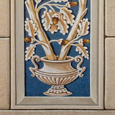
click to enlarge   |   sources below
In the image above,
the center decoration is by Benozzo Gozzoli,
Benozzo Gozzoli  |  Scala/Riverside

The first and third pilasters are by
Filippino Lippi and Pinturicchio respectively,
Italian Frescoes  |  Abbeville Press

In my research, I've discovered a number of Renaissance frescoes that utilize cobalt blue pilaster decorations.

While the Egyptians were known to have developed a synthetic cobalt blue, the formula was lost to later cultures, who ground lapis lazuli to create the rich color. And so it is no wonder that Renaissance artists would concentrate the expensive color in a prominent yet narrow part of a fresco.

My approach to decorative art such as this mural — or the Egyptian door I shared earlier — is usually through draftsmanship. I like to carefully work out everything in advance, sometimes making multiple tracings. I then transfer a design by burnishing it from the tracing.

That way, as you can see, I have a record of my designs, should I need to refer back to them or reuse them.


click to enlarge
The finished doorway.

click to enlarge
Now I'm going to put away the masonry tools for a while and get back to that beam that unites all my columns. Next week we'll be adding a little dimension there to transform it into an entablature.
.

Saturday, April 12, 2014

Pompeii No.7: Painting Hallway Masonry

Mark D. Ruffner


This week I'm concentrating on painting the masonry that will surround the doorway to my hall.

Originally, I had contemplated stonework that was aged and maybe even a little decayed, but in the end, I didn't want an element that would contrast with the freshness of the rest of the mural. Anyway, my Pompeii is not the one of ruins!

I realized, however, that the actual texture of the wall could be used to advantage, to create a rich, subtle underpainting of stone (limestone, perhaps). I started by putting light washes of earth tones on the wall. Then I rubbed away selected areas with a scouring pad.

Once that was done, I redrew the lines representing cracks, and repeated the process numerous times. While all this scrubbing created a pretty nifty stone texture, the look at this stage was not in keeping with the rest of the mural. Not to worry; I added several light washes to approximate limestone.

In making the stonework lighter, one of my goals was to make the stone and columns close in color value. Because the design is going to become increasingly more complex, it will be all the more important for each element to complement the next one.

The finished, more subtle result can be seen below.

Then it became a matter of adding the cracks, with their shadows and highlights. I did this several times. On my first try, I played around with chips and all sorts of unevenness in the lines (like the first photograph of this posting). I quickly discovered that the more regular I made my blocks, the more convincing they were. So most of my irregularities are small ones, at the corners of the blocks.

I'm not showing you the whole doorway surround for a good reason. Next week I'll be painting a panel on either side of the doorway, as though they're inset. They aren't Pompeian panels, but they'll complement the Pompeian design.

No, these are decorations that a man named Francesco della Rovere would have recognized.
.

Saturday, April 5, 2014

Pompeii No.6: Painting the Ionic Capitals

Historic Ornament: A Pictorial Archive   |   C. B. Griesbach   |   Dover
In last week's posting, I painted columns (pilasters, actually) in the Pompeii Room, and now it's time to crown them with capitals.

One of my great pleasures in the process of painting this room is in looking through many art reference books and choosing the elements for the room as though I were actually building a house. And how delightful to know that whatever I do end up choosing will be in stock, as long as I can paint it!

I chose the Ionic capital (above) for an interesting reason. My first choice would have been a Corinthian capital, like the one below:

Historic Ornament: A Pictorial Archive   |   C. B. Griesbach   |   Dover
You can see, however, that the classic Corinthian capital is twice as deep as the Ionic one. As I did my visual calculations, I quickly realized that because the columns don't go all the way to the floor, and are in fact short, the preferred capital would make them appear downright squat. And that would never do!

There are six capitals to be painted, and several shades of auburn and mauve to be mixed, so my approach is to paint all six capitals simultaneously. As I paint one element of a capital, say that highlighted line that goes through the middle, I paint the same highlight on all of them.

That way, all six capitals look like this, with very little variation.

click to enlarge
Here's the Pompeii Room as it appears today.

On the left you can see a block of yellow, which was the original color of the room. In my next posting, we'll turn that into masonry, working our way around the hallway door.
.